Sharky.fi - UI Redesign Concept
I wanted to explore what I like to call the “brutalist modern” style a bit more, so I decided to have a go at re-designing sharky.fi, an NFT lending platform I’ve personally been using of late.
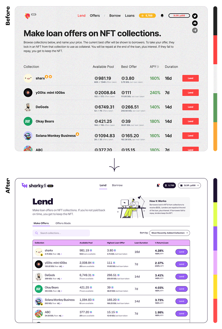
Red isn’t traditionally the best primary accent color in a UI, as red typically denotes something negative (eg. errors). The last thing you want when your own money is involved (like if you were lending to someone 😉) is a negative outcome. I decided to go purple for the primary accent color 🟣.
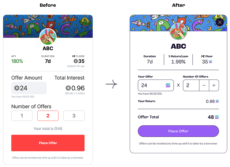
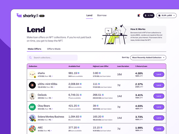
I’m not the biggest fan of how most all DeFi (Decentralized Finance) applications advertise an APY (Annual Percentage Yield), when I mostly tend to use these platforms in short bursts. That being said, I decided to show % Return per Loan, as opposed to APY, for each NFT collection.
I made a few other alterations I felt would provide for a better UX. See if you can spot ‘em above 👀.
Also, shoutout to Streamline Icons for that freebie illustration of the guy at the desk 🤝.