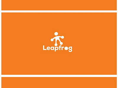
Leapfrog Logo & iOS App Icon Design By The Logo Smith
Leapfrog is my latest WiP (Work in Process) project for a Car Sales website that eliminates the 'middleman/salesperson', with a tag-lie: Jump (or Skip) The Salesperson
Tried to find a relatively non-cheesy/cliche visual way to hint at a salesperson whilst portraying a salesperson, thus turning a frog foot into a 'person'.
The 'o' in frog is consistent, so the logomark can rotate around this to a degree, but when removed form the wording, then the mark can become far more animated and dynamic.
It's trying to avoid to much negativity of a salesperson in a person sense, but adding a slight quirky/cheeky nod to the frog/slime/hop/jump/leap etc. Some 'might' even see a sort of 'crown', but not intended or planned.
I think it’s a nice balance between ‘person’ and ‘frog without being too much of one or the other, and bringing a little bit of ‘colour/life’ to the brand. The visual element can then be pulled out and used easily and very conveniently on it’s own, such as for the Website icon used in bookmarking a page on the home screen of your iPhone.
Might be we don’t incorporate the ‘person’ within the wording at all, just ‘bouncing’ ideas for feedback at the moment.


