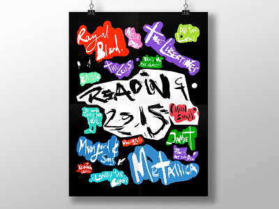
Reading Festival Line Up Poster
I've grown tired of the Reading Festival line up posters. Yellow and black every year. So I thought f*ck it and designed my own. It shows all the artists on the main stage. I used a toothbrush to make the type... as you do!
You can see more of my typographic experiments in the Dribbble Project or on Instagram.
More by Rob Hampson View profile
Like

