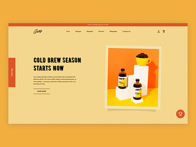
Javy Coffee Main Screen Retro Redesign
The test task that I completed for coffee selling company Javy ☕️ I had to redesign the main screen of their website and the second screen. Stay tuned to see other versions which will be posted tomorrow.⠀
The requirements were to use:⠀
- Old school vibe
- Retro
- Close to the 1950s⠀
▪︎ I used this font to achieve some old feeling and created a grainy background to be more close to retro style. My favorite part of the design is the button 😂 What’s yours? 🤔⠀
▪︎ Fun fact: while creating this work, I listened to 1950s retro dinner songs for at least a couple of hours, it was fun 😊
More by Ana Miskarian View profile
Like
