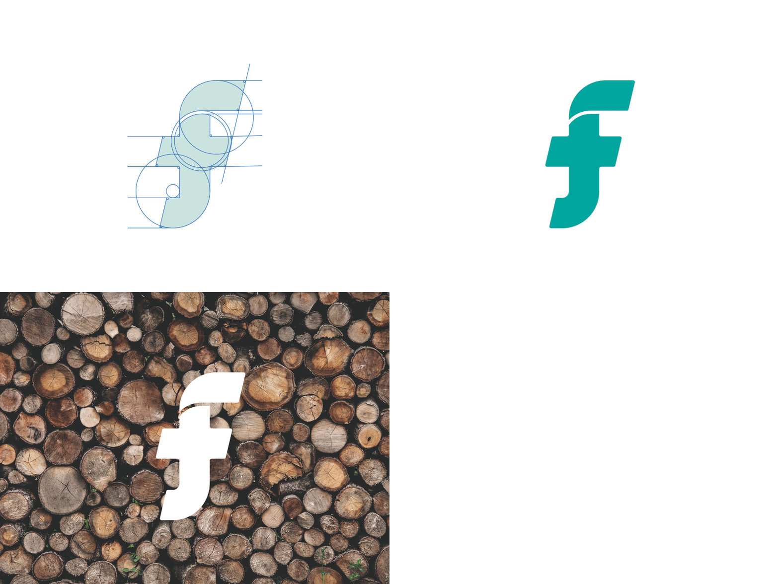
Taylor Froberg Logo
I decided to tackle my logo again. I wanted to simplify the letterforms and get rid of the H that was unintentionally shown in my last logo. Let me know what you think.
More by Taylor Froberg View profile
Like
