Iconjar
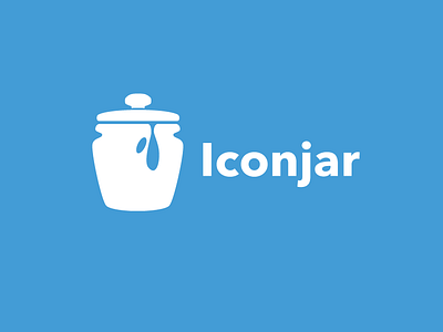
So, there were some things that didn't look right to me in Jord's Iconjar logo. First, it was a little too flat looking. Second, the drip was a little odd looking on the side of the jar. It almost read as more of a void in the jar more so than a drip. Third, the handle to me didn't look centered.
I changed the font to use Avenir Next Bold.
I separated the handle from the lid with a little curve to add depth.
Made the space between the jar and lid a little smaller.
I added a rounded bottom to the jar to add further depth to match the new lid.
I redid the drip, to look more like a drip, and added a small spot split from it.
Colors are the same.
More by Aaron Klick View profile
Like
