ADP Dashboard Redesign
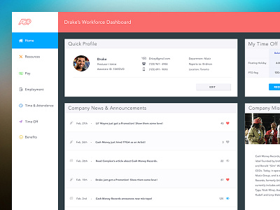
After a rough experience trying to request time off through ADP's workforce interface, I decided it would be fun (yes, I said fun) to redesign it! A little product design practice if you will.
Their experience right now is very sterile and feels like a corporate nightmare. The hardest challenge was turning a boring and confusing experience into something that is welcoming and easy to use.
I also decided to update their logo to fit this new style ;)
Feedback appreciated!