Revvy.
About Revvy.
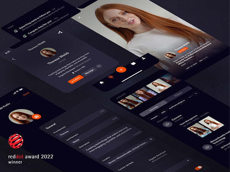
Revvy is a US-based professional social network envisioned to disrupt the recruitment market. Simply put, it is a professional version of TikTok with integrated recruitment functionality. The platform consists of two parts: A mobile application for professionals and a website for recruiters. The Revvy team approached Parkside due to its excellent design reputation. They knew that Revvy would need to have an "A-Level design" and outstanding usability to succeed on the market. The Parkside team helped Revvy to build up an agile design process, pushed & challenged essential product decisions, created a design system and design language, defined and executed a user research plan, and, last but not least, handed off all deliverables on time.
Challenges & Objectives.
The design process with a team of 10+ experts spawned across three companies and four countries. Given that we had 6 Designers working on the same platform, we had to pay special attention to keeping our designs consistent and establishing regular design review sessions to keep everyone in the team on the same page. On the product level, our two main challenges were to design a frictionless recruitment process and to make the process as inclusive as possible. We had to ask ourselves:
1 . How can we make the hiring process as frictionless as possible?
2. What information do we gather from candidates, and how do we present it to recruiters?
3. How can we encourage users to create and upload videos to the platform?
4. Based on which parameters does the AI match candidates to job opportunities?
5. How do we integrate a Chatbot into the hiring process? What personality should the Chatbot have, and how should it interact with the candidates?
6. How can we reduce discrimination in the recruitment process?
User Research & Testing.
We went for a flexible and iterative User Research approach, so we could push through uncertainties step by step, find usability issues early, and test new ideas quickly. The two main target groups were recruiters (2+ years of experience in HR/recruiting) and candidates (18 to 35 years old/active on social media). The goal was to determine which features are needed by the target groups and ensure that the product is accessible and inclusive. This formed the baseline for the following research strategy.
Wireframing.
Low and high-fidelity wireframes helped us create tangible user flows for the product vision. We used them to present our UX decisions to the client, test different approaches, and build the logic behind Revvy without investing too much time into aesthetics initially. Refining client requirements and intensely collaborating within the team became essential to crafting impactful wireframes and clickable prototypes.
UX Writing & Hubble the Chatbot.
Additionally to revising and strategizing all copies used in Revvy, we also conceptualized a Chatbot called Hubble. Chatbots are a great way to automate processes and provide a more conversational UX. Our highest priority was creating an encouraging and inclusive conversation between Hubble and the candidate by avoiding common stereotypes and fostering a positive, non-judgmental environment. In total, we wrote over 60 messages for the initial version of Hubble. The AI behind Hubble learns from all Revvy conversations and improves steadily to craft not just an efficient but also an enjoyable and refreshing hiring experience.
Casual Vocabulary but Formal Writing.
As a robot, Hubble follows grammar and spelling rules very precisely. We actively decided against letting it use contractions (don’t, isn’t, can’t,...) for the sake of sounding more robotic.
To give Hubble that human touch, we added human expressions, so-called interjections (Ouch! Oops!...). One can imagine that Hubble picked up these expressions from his human friends and memorized them as an easy, quick way to sound like them.
Hubble the Space Robot.
Hubble likes to use space references to check in on the candidates and is an authentic conversation partner that can be trusted and sympathized with more quickly than a monotone Chatbot that tries to get a job done. As a self-aware robot, Hubble will frequently consciously and subconsciously refer to that. A robot like Hubble does not get tired; it runs out of battery. Hubble also does not need to sleep but may have to power up after being on standby.
Design System.
The UI design for Revvy was crafted around a futuristic space theme. One of our goals was to target younger audiences like millennials or people who just joined the job market. Throughout the design process, we explored various possibilities, some of which carried us out of our comfort zone. We played with dark shades of blue and purple, creating a bold contrast with the orange primary color. The resulting color scheme, though adventurous, is perfectly suitable for a video-heavy platform like Revvy. Due to the stark contrast, the orange has a significant visual impact and easily guides the users through the app with clarity.
The resulting design system had to fit mobile and desktop app requirements. Because the mobile app is for job seekers while the desktop app is for recruiters, we faced the challenge of creating a modular design system that would work seamlessly for both platforms and the different target groups. With adaptability and scalability in mind, we build hundreds of components and responsive building blocks. Through this, we solidified Revvy's brand identity and created a consistent and credible experience across both platforms.
The resulting design system had to fit mobile and desktop app requirements. Because the mobile app is for job seekers while the desktop app is for recruiters, we faced the challenge of creating a modular design system that would work seamlessly for both platforms and the different target groups. With adaptability and scalability in mind, we build hundreds of components and responsive building blocks. Through this, we solidified Revvy's brand identity and created a consistent and credible experience across both platforms.


