Credit Card Checkout #DailyUI #002
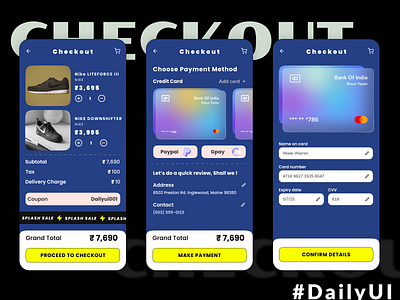
Hey there, for today's challenge i.e. Checkout page, I chose a simple layout with a bold CTA to highlight the primary focus of the screen. for cards I went with Glassmorphism to give user some attraction to latch on and some Repetition for usability . ⚡✔️
Do like and leave a feedback for me 🤞, Thankyou
