Product page optimization 🍾
This is the product description page. And it is the screen where most customers make the decision to add their products to the shopping cart or not, so it is necessary to restructure the content to improve its display.
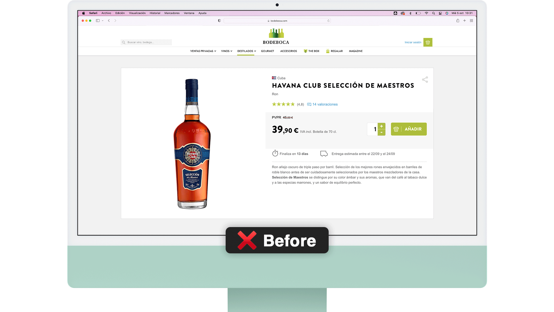
🪨 Obstacles
During the redesign I encountered several obstacles that delayed me a few days, so I had to quickly improve the proposal on the fly to be able to meet the agreed deadline.
On the other hand, the company asked to keep as many elements as possible from the previous design to reduce development work, which was a challenge for me.
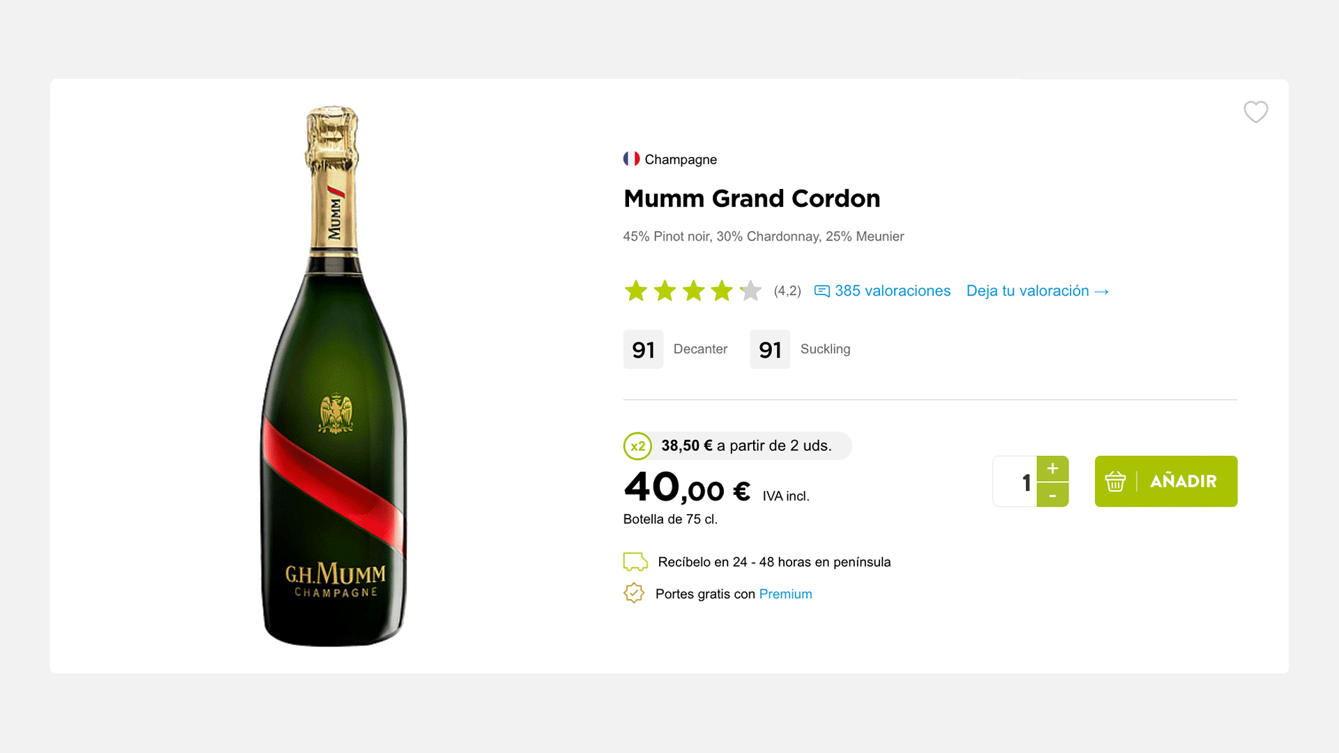
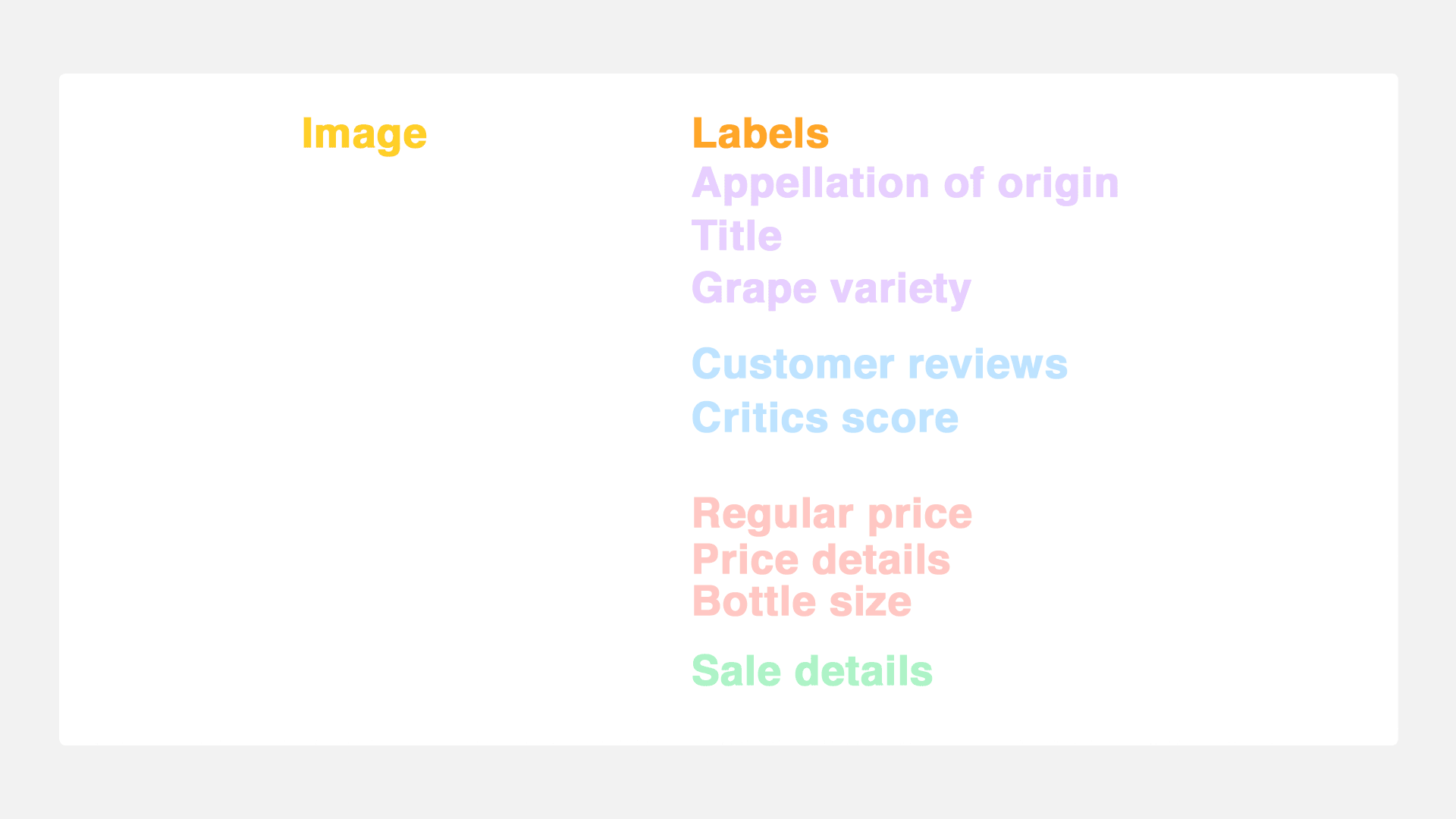
🖌 Time to (re)design
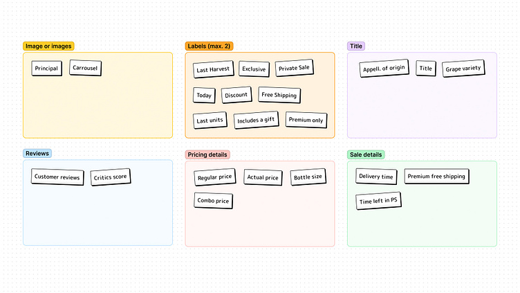
With a long briefing of changes determined by the type of bottle and the need to keep the new design as simple (and similar) as possible to the old one, I chose to segment the information to show by type according to its hierarchy.
Then, I brought it to reality...
📱 Responsiveness
Starting from the desktop display previously approved, I must adapt the design to improve its usability regardless of the device used to navigate.
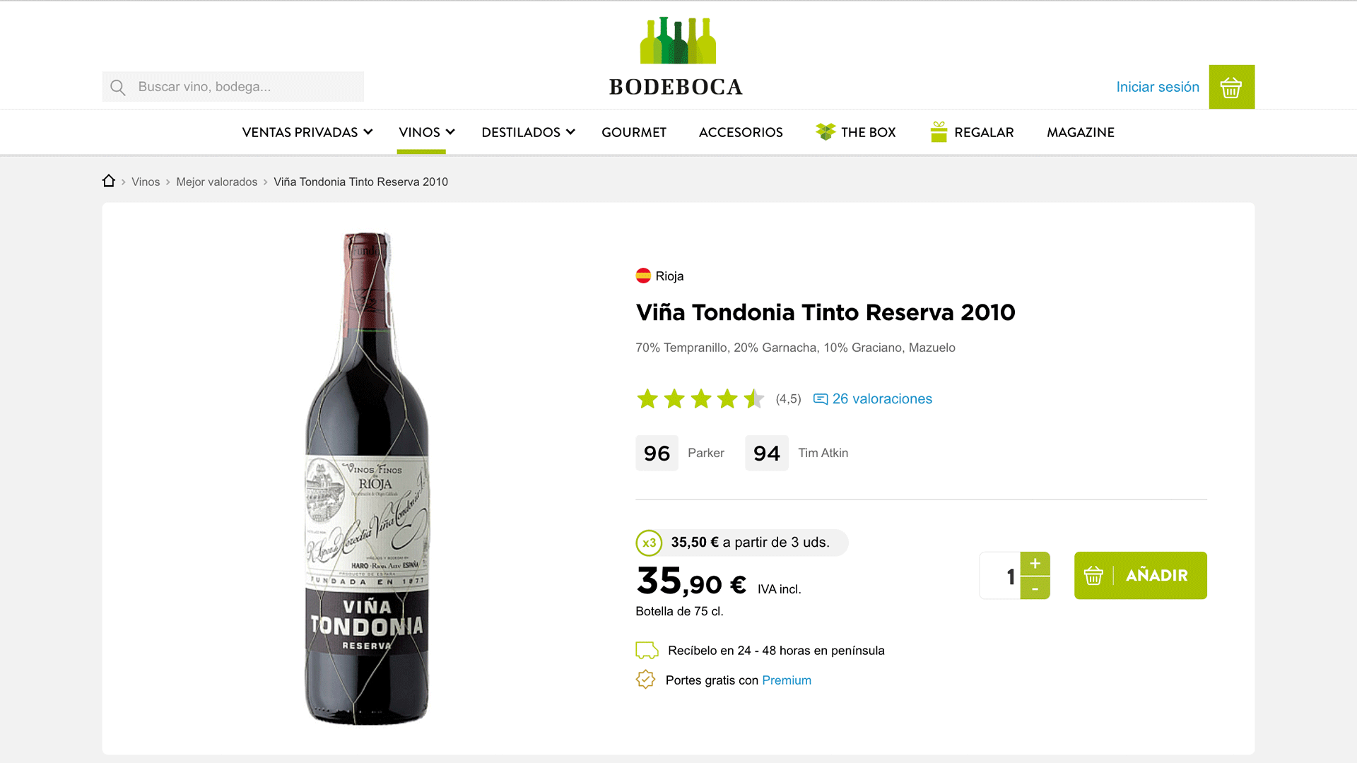
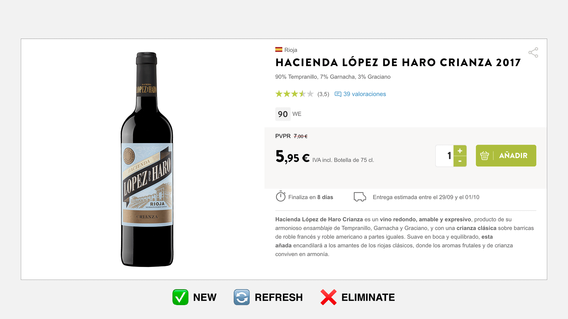
✨ Ta-Daaa!
Meet the result online by clicking here. Make sure to play around, it was also applied to the complete Bodeboca's catalog with different specifications.