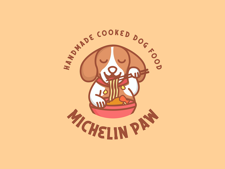
Michelin Paw - Logo
Michelin Paw Visual Identity
Michelin Paw is the premium dog food brand for pet owners who want to give their dogs the best.
The taste of Michelin Paw dog food is unique in that it is a popular human food flavor, but with human ingredients: Spaghetti Bolognese, Fish and Chips, Paella, Chicken Korma and Rice, Sunday Roast, etc
Michelin Paw wanted a consistent, memorable brand with a visual language that would resonate with their customers and serve their marketing team for years.
New Color System
The style is simple, well-structured, and easily digestible, conveying a sense of security. Trustworthiness is represented by a clean layout, serif font, and darker shades of brown for the premium nature of their product. Yellow, and apricot, on the other hand, look innovative and modern, allowing the brand to scale and remain relevant for years to come. The contrasting balance of colors helped us convey Michelin Paw brand values with its premium and trusted.
Aligned towards the audience
After extensive research on several different users, consisting of animal lovers, dog owners and pet food vendors, we revised the visual identity of Michelin Paw and developed a website platform that exclusively addresses these groups and caters to their needs.
-----------------------------
Hope you guys enjoy it and press "L" if you like it. Got any feedback or comments? Feel free to leave in the comments below.
-----------------------------
We are Oasis Team Visual
Oasis Team Visual is a digital agency crafting holistic, people-friendly experiences. We serve as a strategic partner for fast-growing tech companies in need of a scalable website with modular CMS, a design system, and future-proof brand identity. Through challenging core assumptions, we shape the products and services that improve the lives of thousands every single day.
We help you create, convert, improve or scale your project. Fast turnaround. No contracts. money-back guarantee.
Have a wonderful project? Send to our email: ✉️Oasisteamvisual@gmail.com


