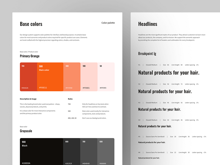
Colors and Typography for Web Design System
Question for today:
What to do when you start working on a new project and you see that everything is all over the place?
Last year I had the pleasure of working on a website project and being responsible for the visual design and design system (which didn't exist then). I want to briefly tell you how I approached that and what I managed to do.
What to do to bring value as soon as possible?
Start with the basics.
The website had a pretty cool brand book and was trying to use it somehow — but without consistency and a more extensive plan. In between making visuals for new features and redesigning current ones, I was trying to bring the first iteration of the design system to life to fix that problem.
And when it comes to the basics — the easiest ones are colors. I took the primary colors from the brand and created a system of building new colors and shades on top of it. Implementation of a couple of hex codes was just a formality.
How can the new typography be introduced to a big existing website?
Work around limitations and simplify what you can.
Colors were easy, but then I faced a boss fight. Existing typography had no rules, tons of hard-coded texts, and zero style consistency. I had to find the values that often repeat and unify them to avoid breaking the current design too much.
So I combined dozens of more or less unique texts into around 15 styles for each website breakpoint — headlines, paragraphs, and custom styles. How did we manage to implement them is a story for another time.
I hope you find it helpful!
For more, check out my profile and hit follow!
If you have any questions or want to chat, connect with me on LinkedIn!


