CLOU Architects
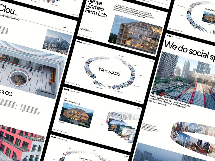
The website is the driving force behind CLOU’s marketing outreach. The first port of call for prospective clients and pivotal in the public's perception of their brand. Embodying their brand's essence, encapsulating the user and providing the same intuitive utility that CLOU strives for in their own work, was at the very core of our approach to this project.
Our Approach
The digital experience needed to mirror CLOU’s ethos – the simple and minimal visual language uses a monochrome colour palette, allowing the work to speak for itself. CLOU wanted an innovative way to display their work, so it needed to be visually impressive but most importantly functional. It was this key desire that led to the development of the project ring which sits at the epicentre of the website. The word ‘CLOU’ is defined as “an idea that transforms the ordinary into something extraordinary; or a design that fulfils multiple objectives'' and it was this very ideology that inspired our approach for CLOU’s project page.
Multilingual
A major consideration was the bilingual requirements of the site. It needed to look good with both English and Chinese characters. Therefore, while designing we layed out two versions of the site in tandem to ensure this was well considered throughout the design process.
Initial Concept Exploration
Here is a peek at some early concept exploration that went into creating CLOU’s project ring. We hope you enjoy seeing a bit of our experimentation.


