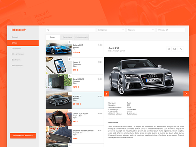
Leboncoin.fr
Hey,
I redesign the french website, leboncoin.fr.
It’s the a website in the top 10 most visited sites in France. It was created for sell between private individual but it know a real success and now, it’s a leader for the purchase and sale of used cars or seeking for an new apartment. And now, many companies publish job offer.
The company was focus for developing the application mobile but 60% of visits are on the website.
Before to enter in the website, it was necessary to select a french department and after type the keyword. It was not useful. So I decided to delete this first page, and now we have directly the home page and you can research and after, refine your research with the location etc.
With 3 box (menu, result, announcement) it’s more useful, you don't need to click the 'Back' button on the top of your browser.
For the logo, it’s more simplistic like theirs contestants :).
Go to the Find me on leboncoin.fr to see the difference.
I'd appreciate some creative feedback :)
Press L if you like it
---
UPDATE : The price in the third box
---
Find me on Twitter

