NFT Marketplace Mobile App Exploration (Dribbble UI Course)
Context
As a mentor at a 6 Week UI Design course by Dribbble, I was teaching my students about UI basics, design process & Figma hacks in our mentor sessions.
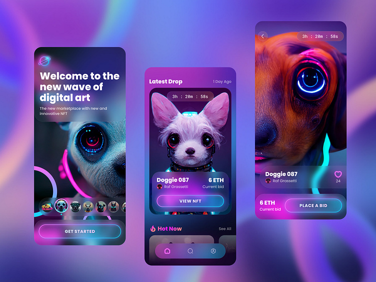
As a side effect, I created these NFT Marketplace screens following the lessons by Daniele Buffa together with my students.
So I decided to explain a bit about the design process we followed during this course.
Hope this will help to decide whether this course is for you or not.
Challenge
All the students were provided with a "brief from a client" - a startup with the goal of revolutionising the NFT marketplace with a design-first approach.
According to this brief, the objective is to establish the visual language of this new NFT marketplace app. Lock a visual aesthetic and then scale the design on multiple screens, based on the wireframes and the flow that is provided by the client.
Design Process
The design process suggested by the course contained the following steps:
1. Research & Moodboards
2. Visual Exploration & Experimentation
3. Locking & Scaling Design
4. Design System & Components
Moodboard
We started our design process with research & moodboard creation. We collected various images, elements, and icons from multiple sources in a Figjam file. Then each student was able to create their moodboards.
Below is my moodboard. As you can see - from the very beginning I was on the dark side. 😈 Also, I was planning to use illustrations generated by Midjourney AI.
Visual Exploration
My moodboard led me to 2 visual concepts. I experimented with more strict typography & straight corners first. But I felt like it was not the right direction.
The second concept with more soft corners, a lot of blurred elements and neon was definitely more interesting and would fit into the futuristic direction our client requested.
Locking & Scaling Design
After a round of helpful & constructive feedback, each of the students decided on the visual directions they want to follow. In my case, it was concept #2.
Then we started working with wireframes provided by our "client". So basically in these steps, the goal was to scale the chosen concept to more screens and see how it works there.
I was a bit lazy, so I created only 4 screens. 😅
Design System & Components
The next step was creating a simple design system and Figma components from our screens designed in previous steps. This should help with establishing consistency and finalising screens. 👯♀️
What I learned
🥳 Being a mentor is fun. I really enjoyed sharing my experience & knowledge with new designers. And following Daniele's lessons was a refreshing experience, creating designs from scratch with no established design system or even branding.
At the end of the last session, we had AMA (Ask Me Anything). It was really challenging to answer all the questions. But I also felt more connected to my group. Hope to be a better mentor next time! 👩💻
🤩 And I’m really proud of all my students that created amazing NFT case studies. Check them out!
Follow me on my 📸 personal or 👩💻 professional Instagram.
Or visit my website to learn more about me.
🎓 Learn more about Dribbble UI Design Course & Product Design Academy


