Planet: The new wave of NFT art
The Client
The client is Planet; a new up and coming startup with the goal of revolutionizing the NFT marketplace business with a design-first approach and a deeply curated experience for the users.
The main objective for this project was to establish visual language for Planet’s new NFT marketplace app. They’re attempting to revolutionize the digital art scene, so they were looking for a visual aesthetic that differed from their competitors.
Key deliverables included:
Locking down the visual direction.
Scaling the design on multiple screens (based on the wireframes & flow provided from Planet.
Build a UI library.
Create a functional Figma prototype.
The Audience:
The audience of this project are people who are embracing and following the world of NFTs and digital art. This mainly includes tech savvy people that know their way around online, both in the world of crypto and NFTs. They also have a strong sense for visual aesthetics and art.
This audience values curated and beautiful experiences as much as they value it with the digital art that they create, buy, and/or sell.
Wireframes
Below are the initial wireframes the client provided.

Moodboard
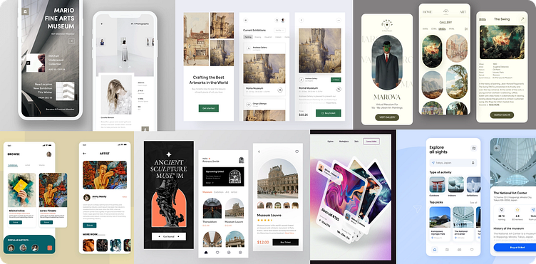
The Research
From conducting a competitor analysis, I found that many other NFT marketplace apps focus on a futuristic and dark design. To differentiate Planet from other available apps, I decided to go in the opposite direction and choose a design style that work evoke feelings of an immersive museum or art gallery.
By conducting user research with five potential users, they found this light, art gallery feel to be more inviting than other NFT apps they’ve looked at before. All five users considered themselves tech savvy, but said they were intimidated by many NFT apps.
With this UI, Planet will aim to present its artists' works in a new simple format that brings immediate attention to the NFTs while bringing in a new wave of users.
UI Library
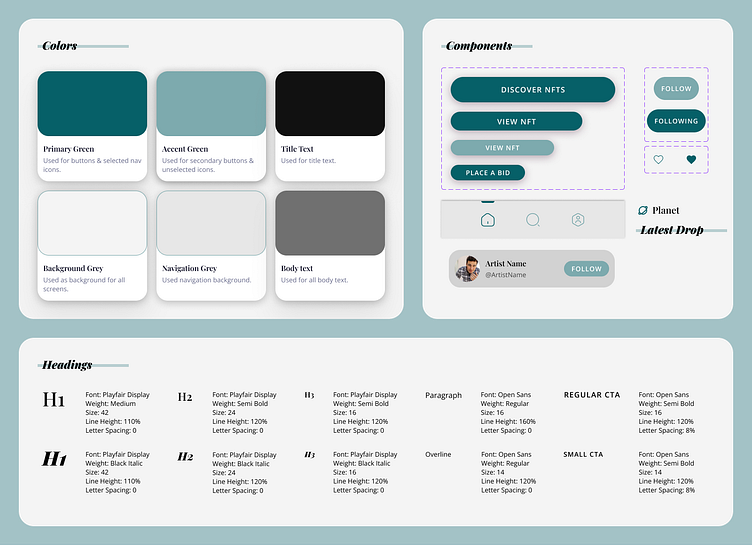
After creating the moodboard, I began playing around with colors and type fonts.
Ultimately I decided on a sea-foam green as the primary color with a light grey background so the app would have a minimalist feel.
I also chose Playfair Display as the title font to give the app a fun editorial feel while using Open Sans as the body text to keep things simple.
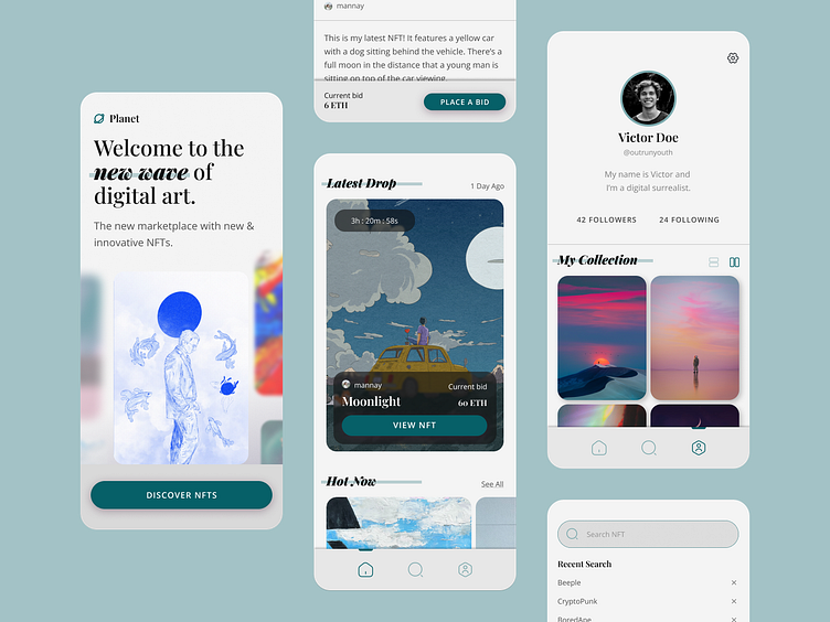
Final UI Design
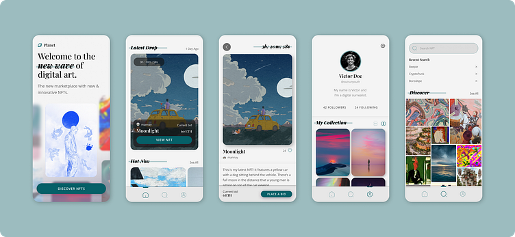
After the creation of a color palette, type library, and components, the wireframes became this final UI product!
Prototype
To see what the app looks like in action, watch the video below or click on the link!
