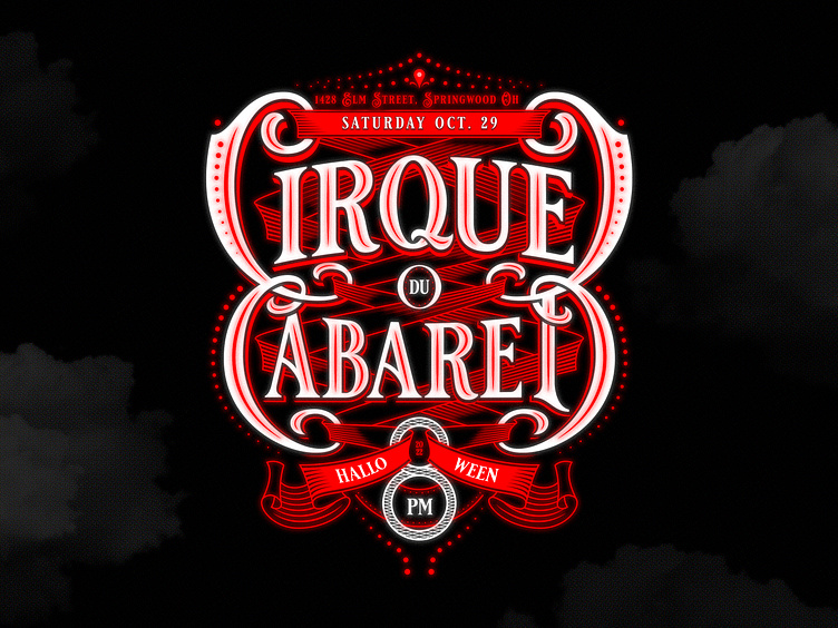
Cirque Du Cabaret
An elaborate Halloween party requires an equally consideration invitation. I rarely have the chance to create something so sexy and spooky, so I used the opportunity to blow the dust off of my Victorian typography chops. I leaned on some inspo from a few of my favorite designers (Martin Schmetzer, Tobias Saul, and Srdjan Vidakovic, among others) for this "just for fun" project.
Almost immediately out of the gate I knew i wanted to incorporate the straps of the back of a corset into the design. I was stumped until i realized that the straps could be held by some of the letters' dramatic swashes.
The ribbons proved to be the trickiest part of the design; figuring out how to make them interact with the type without detracting from the legibility of the title of the event itself. I found that a downright silly amount of clipping masks ended up being the best non-destructive way to hit the final (moving) target.
Of course actual event specifics needed to be added, and I wasn't about to shove a square peg in the design's round hole, so adding a small but spicy event maturity rating box to the bottom served as my out.
Looking forward to a saucy evening of delinquency and debauchery ;)


