Designlab UX Academy Foundations | Colour palette for app design
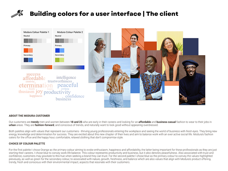
After analysing the competition, I created two colour sets to include neutral, primary and secondary palettes. I searched for pictures that represented their target audience, and I started thinking about the feelings I wanted their brand colours to evoke. The photo collage I created helped me identify predominant colours that also aligned with the brand. I used the Material.io Design color tool to help me refine the colour choices, which I then imported into Figma.
Each set included a primary (the most prominent colours displayed across your website or app's screens), secondary (highlight, action, or accent colours) and neutral palette (used for page backgrounds and text/body copy). I also included a word cloud showing what the colours represented, as well as a short description of the customer and the values I was trying for each colour palette to be associated with.
See my portfolio | Follow me on Instagram ⦁ Pinterest ⦁ LinkedIn