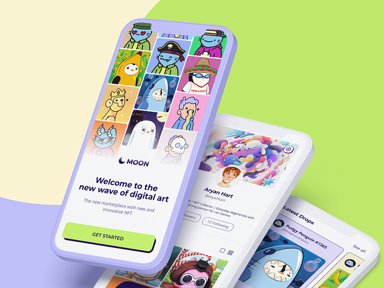
Moon 🌙 - NFT Marketplace
Hey everyone! 👋
I’ve decided to enroll in another awesome Dribbble course: Intro to UI Design. For this course, we had four weeks of amazing mentor sessions and a big project to work on ⎯ a new startup called Moon.
We had a brief with all the information about the objectives, key details, audience, and the client. The main tasks were to do:
A new visual language for a new NFT marketplace app
Fully designed flow in High Fidelity
UI library
Functional Figma Prototype
1. Moodboard & Visual Exploration
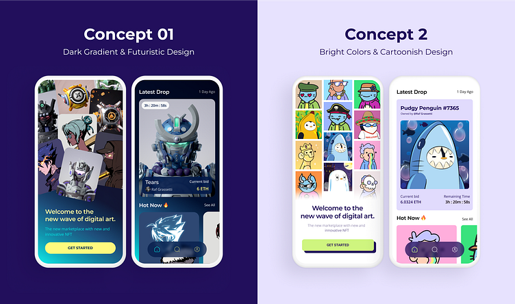
The main focus for the second week of the assignment was to build a mood board for two different concepts, create a color scheme, choose fonts and play with iconography and the layout of the screens. I had two ideas from the beginning: a stylish, dark mode app with a focus on gradients, and the other one a cartoonish and clean app, combined with bright and playful colors. I started organizing my two mood boards and from them, I had to build the concept for Splash and Home Screen.
For the first concept, I created a gradient with blue tones and a yellow pop of color for the CTA and titles. I wanted the UI to be more futuristic with rounded buttons, blurred bottom navigation, and a minimalistic hero card.
For my second concept, I wanted to have bright colors and cartoonish buttons with a dark solid shadow underneath them. This concept was mainly inspired by old cartoonish game cards like Pokemon for example. As a final touch, I wanted to complete the UI with a clean background and additional square-shaped elements.
2. Polish & Scale Design
After creating the two concepts, we had to choose one and build a visual design for all the provided wireframes.
Following some feedback sessions together with my mentor, classmates, and additionally some friends and family, I decided to go with the second concept. Personally, this was the best outcome, as I have been aiming for quite a while to design a fun, bright, and cartoonish interface for this project.
2.1 Home Screen Exploration
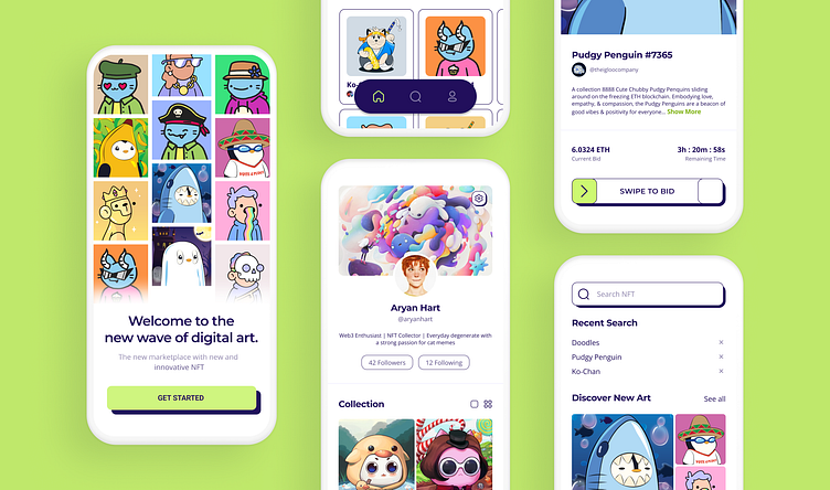
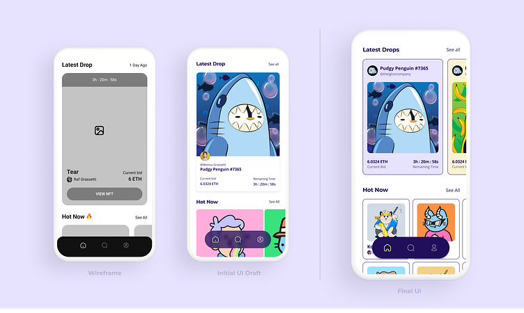
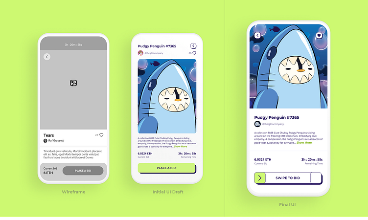
For the Home Screen, I wanted to have a different approach from the wireframe, especially with the hero card. The main difference between the initial draft and the final UI is the first section.
In the initial draft, I wanted to emphasize the hero card with more structured information and a cleaner look. Based on additional research, I changed the first section from a singular card into a slider. Also, after doing the hero card, I wanted to have the same design for the second section - Hot Now - with the image inside the card.
2.2 NFT Screen Exploration
With the NFT Screen, I wanted to keep the same structure as in the initial wireframe. After experimenting with the design, I decided to increase the size of the image and split the info into two small sections to have a clean and easy-to-read screen.
One of the main changes from the initial design was the transition from a normal Bid button to a swipeable one. For all the buttons, I maintained the dark cartoonish shadow to make them stand out more.
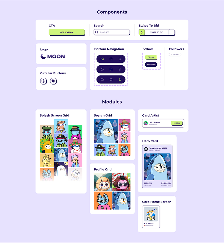
3. UI Library
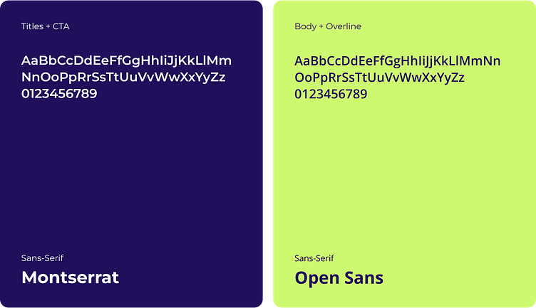
One of the key features of this UI was typography. I started this process by researching sans serif fonts. I ultimately decided to go with Montserrat for titles.
For the body and overlines, I experimented with a different font, a more simple and easy-to-read one. I researched for the best font combinations and in the end, I went with Open Sans. It has a neutral and friendly appearance and also it has excellent legibility characteristics in its letterforms.
For the colors, I integrated a purple/blue shade and one bright color to have better contrast. The dark color is used only for text and button shadow while the green one is for the CTA in order to stand out.
For the components I kept them clean, based only on my two main colors and also integrated white as a background.
Because of all the colorful images and alignments, the modules have a playful and fun appearance. Together with the simple yet clean typography combinations, the cards are easy to read focusing just on the core information.
4. Final Thoughts
After doing these two courses within four months (Product Design and UI) I am proud of myself. I’ve had the opportunity to learn so much about this industry, and product design, and also focus on the UI fundamentals because of this course.
I have a lot of work to do next but I feel more confident than ever in my decisions as I have better knowledge now about building visual app designs. I've learned how to approach and explore ideas, create concepts, polish designs, build a UI library and be more open to prototyping.
Thank you to @Jose Rodrigues for the weekly mentoring sessions, and feedback. To our main teacher @Daniele Buffa, thank you for the comprehensive course materials that I will constantly come back to in the future, and last but not least, huge thanks to Dribbble for making this course available.
It's been a pleasure and super excited about my future as a fresh product designer! ✨
__________________
Love this case study? 💚
Subscribe for more future shots and don't forget to press L before you leave!
