NFT moon UI project
Brief
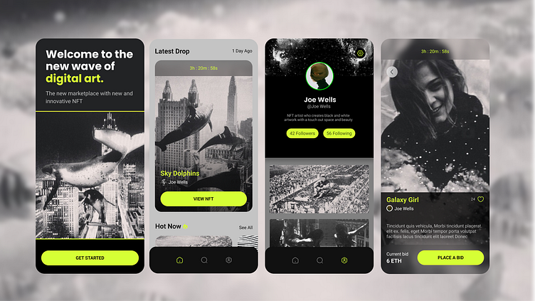
For this course I was contacted by a client named moon. They are a new startup that has the goal to revolutionize the nft market place with their design first approach and have a well designed experience for their users. Objective is To have a visual design look in the NFT marketplace app that will help create something new in the digital art scene.
Moodboard
The moodboard I created helps me to find colour combinations and layouts that would help create the best mood for my users.
Wireframes
the wire frames that i created for the ui course were done to be simple and show the best nft’s for the users. The users patterns are simple and the modules and buttons are made to be easy to interact with and see.
Visual exploration
For my visual exploration I chose to do a black and white nft app. I chose this main colour scheme because it’s very disability for with it’s large shapes and have having bright coloured buttons for important interaction spots.
Design system sample
Final visuals
Summary of what I learnt
Completing this project has given me the foundation and basics for ui. It also has given me the inspiration and confidence to keep going on my product design journey. What I've learnt during this course is to plan and try different ideas and concepts for screens. This course has given me the insperation to keep trying and to try pushing my skills further.


