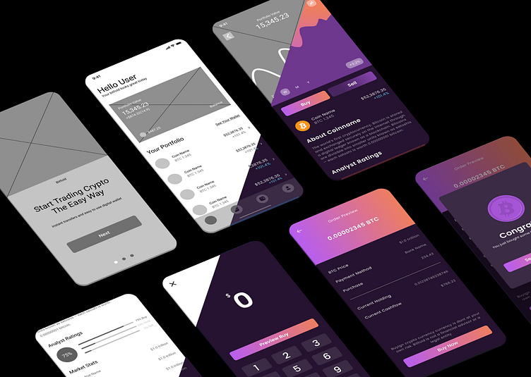
Crypto Currency App UI
I made this design as part of the Dribble Design course. The wireframes were already given. Unfortunately, I didn't have much time to change anything in the layout, so I just focused on the UI.
Before
I decided to use a dark UI, because I thought that it fits very well to a cryptocurrency app and dark mode is getting more and more popular. I chose purple as the main color, because purple is often associated with money, as the 500 Euro bill is also purple. On the 500 Euro bill is also an orange color. Inspired by that I used a coral orange together with a light lilac for CTAs and Design Highlights. In contrast to these and the dark UI I used a neon blue as an accent color.
After
More by Noemi Drabant Pérez View profile
Like


