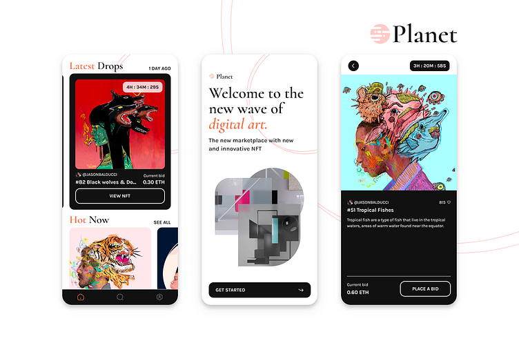
Planet: A NFT marketplace
The brief
For the project of my UI Design course I got a brief from a fictitious company called "Planet" who is gonna launch a NFT marketplace. Based on it I shall create moodboards, visual directions and present the final design.
The moodboards
I made research towards two different styles. One currently more common style among the topics around NFT and Web3 (called "Fancy clean"). And one where I combine the style of more elegant and traditional art. I especially focused on the look & feel of printed art magazines (called "Magazine style").
The wireframes
The client already provided me some wireframes to design. So in this case I wasn't asked to make User Research and all the other parts of the Product Design process. I could focus on the visual part.
The visual directions
Based on the styles, look & feel, the colors, fonts, etc. I have saved in my two moodboards I created 2 different splash screen designs each to get a feeling which directions the visual design can go.
The final design
I got intrigued by the idea to combine elegant, traditional art and the magazine style with the new technology and movement of NFTs. So I decided to go for this direction and - after some iterations - polish and scale the design.
To have a consistent look & feel and bring the user's focus to the artists artwork I reduced the amount of font styles and the used colors during the iterations.
The prototype
Feel free to try the final prototype!


