NFT Marketplace App
The Challenge
It has never been easier to invest your money than it is today. Purchasing cryptocurrency and other assets is done with a few clicks, and holders can get constant updates on current prices. Users and collectors are relentlessly searching for aesthetically pleasing digital art that conveys a sense of beauty.
The challenge was to create a clutter-free, modern system that provides users with all relevant information and allows the brand to be recognizable throughout the product.
My Role
The client, a growing NFT marketplace platform that the team at Dribbble introduced within four weeks, took center stage. The main focus was to make browsing and purchasing NFTs as easy and user-friendly as possible. Based on a design brief and wireframes provided as a starting point, my task was to create two visual directions tailored perfectly to the job.
My Approach
I started by looking at competitors in the market and working out MVP features. I especially noted user experience design choices I didn't like in the competing platforms to improve them.
The next step was to create a mood board to evaluate an initial design direction and have a good starting point for creating the first screens.
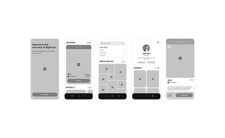
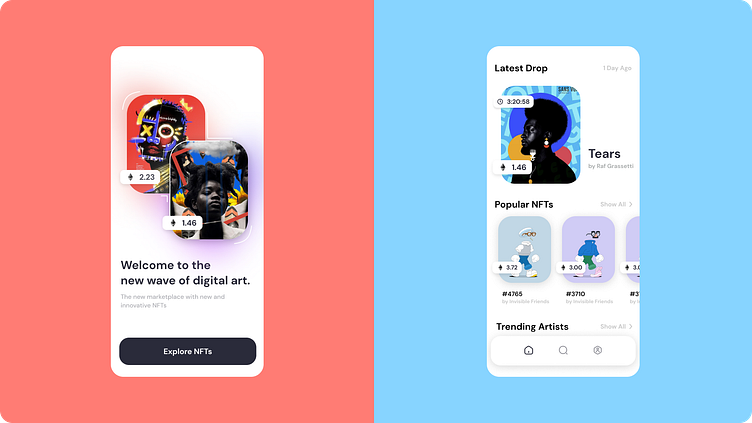
Visual Direction #1
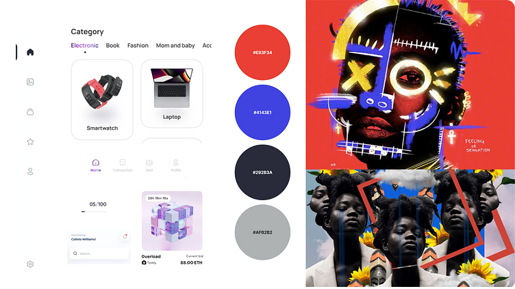
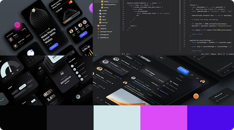
The first approach is very minimalistic in terms of color and layout. By using mainly black, gray, and white, the colored NFTs, which are the main focus, stand out directly. Selectively applying blue accents draws the user's attention to specific screen areas. White outlines and shapes also make the highlighted art even more enjoyable.
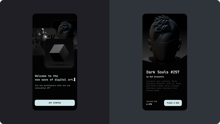
Visual Direction #2
To not get too stuck in one direction, I also worked out a second approach that would be fundamentally different from the first.
The other direction is much darker overall. Instead of a sans serif font, I used a monospaced font to emphasize the digital aspect of the platform through a visual similarity to so-called development environments.
Polish & Design
The process became engaging as I continued to push the boundaries of getting the color, feel, and components right. Tweaking fonts to find the right style, with just enough color to not distract the user's eye too much, became an iterative game. Subtle changes to button types, iconography, and textures for both directions began to take hold, and I settled more and more into the first design.
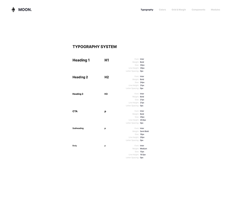
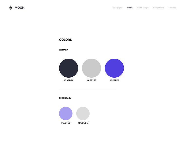
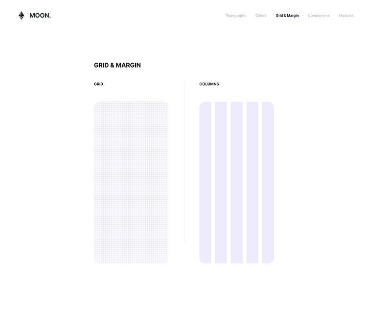
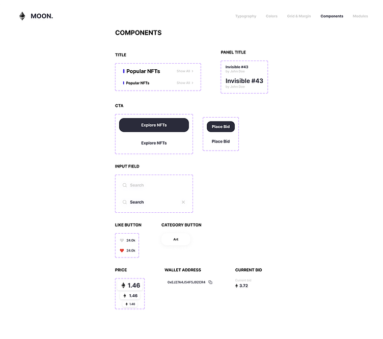
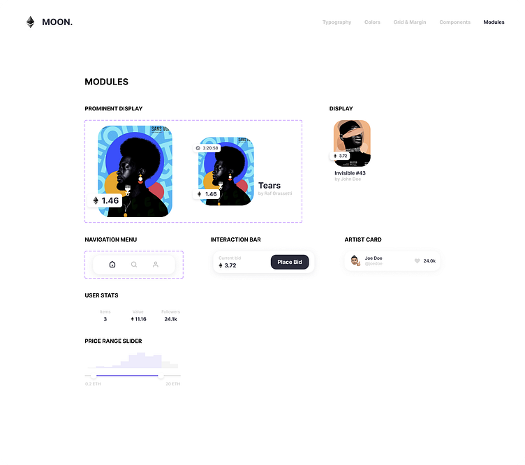
Once confident with the design, I brought all the components, modals, fonts, and colors together in a style guide. At the same time, I also generated reusable styles and elements in Figma to save me time in the final composition and to be consistent across screens.
Prototyping
Lastly, I created a prototype to bring the final design closer to the client in the best possible way and make it tangible.
I took special care to reproduce transitions as realistically as possible so that the prototype could also be used as a reference point for the actual programming of the app. You can see the final result below.
Conclusion
I have been able to learn many things while doing this project. Most importantly, I realized that if you turn off perfectionism for a little moment, you can come up with entirely new and beautiful ideas.
Special thanks to Daniele, Nadya, and the rest of the Dribbble team, who made this trip possible, gave me many helpful tips along the way, and always supported me when I got stuck. 🫶
I am looking forward to everything that is yet to come!
Cheers!
