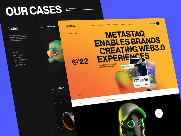
Desktop version of the Cases page & Single case intro | Lazarev.
Salut, guys 🔥
Ready for a splash of creativity and innovation into your Dribbble feed?
Rhetorical question cause here it is.
Happy to show you a trendy, professional, and high-performing website for the design agency — our agency, btw.
Specifically, on these shots, you can see the Cases webpage. Despite its data-heaviness, it’s crystal-clear with a simple interface structure, contrast colors, and smooth animation. And those 3Ds — how can they be so cool? Well, they can when true professionals get down to business.
What about innovation 🤔
Pff, welcome Metastaq — our recent Web3 project fully designed from scratch. There is a whole case on the website where we gathered all our insights, ideas, design process stages, and everything in between to reveal step by step how we create projects of this scale.
Thanks to spectacular video materials, animations, thought-out case structure, color accents, and digestible content, it’s so easy and convenient to comprehend the info. So give it a try by following the link.
Before leaving, tell us what you think about the shot and hit ❤️


