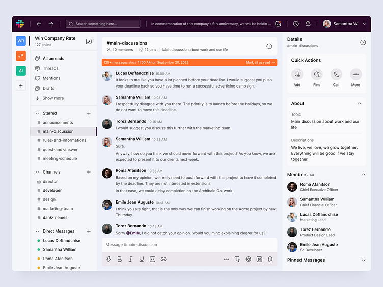
Slack Website Redesign
Howdy, Mate!
Here, I want to share my work of redesigning Slack Website. Slack is a messaging app for business that connects people to the information they need.
I did this design for a challenge held by Uplabs.
I got an idea to tried with a modern color to look more fresh and professional. I also changed the border radius to be more rounded to give a fresh, modern, and simple looks for users who access it.
Vote me for the challenge here and get the design for free on my Uplabs!
Let me know what you think!
Feel happy to get some feedback and press (L) if you like it.
Thanks!
Follow me for more great stuff:
Dribbble | LinkedIn | Instagram
========
Have an awesome project?
Let me know and drop it at work.raafi@gmail.com
========
More by Raafi G View profile
Like
