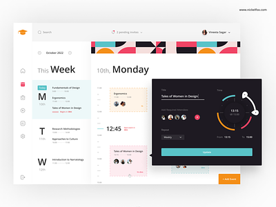
E-Learning Dashboard
Hiya! 👋
Combining visual communication skills with an understanding of user interaction, this E-Learning dashboard is formed. This design is intuitive and does not have a lot of distractions while being engaging at the same time. In this screen, the Schedule module has been emphasized wherein users can plan their classes, lectures, or study events.
Colors:
#F04465 - Primary Pink
#F48F18 - Primary Orange
#59C3C8 - Secondary Blue
#1E1A22 - Black 1 used as dark graphics
#333333- Black 2 used as text color
#FFFFFF - White for base
Font:
Khula (SemiBold) - Headings and more prominent texts
Khula (Regular) - Body texts
Asset Link or credits:
Icons are from Iconly
Technique:
Overlays
Our designer says:
“I wanted to narrate a story when interacting with the screen from left to right. Starting with selecting the module and ending at setting up an event, the flow has been kept aesthetically progressive - keeping it minimal and organized at the same time has been my goal." 😊
Feel free to give me some feedback.
And don't forget to press "L" if you love it. ❤️
--------------------------------------------------------------
Download File Here
--------------------------------------------------------------
Have an idea? Let's talk here or WhatsApp
Follow us here:


