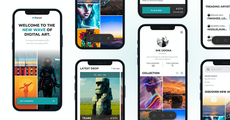
Out of Space NFT App: UI Design
The Challenge
With Web 3.0 taking center stage, NFT’s have played a major role in its evolution. Users and collectors search tirelessly for aesthetically appealing digital art that represent a sense of beauty. As these unique pieces continue to surface in various marketplaces, the challenge was to create a fresh visual system that can help the brand become recognizable throughout its digital product.
My Role
The client: Planet (previously Moon, lol), a growing NFT marketplace app introduced by Dribbble’s team during a 4 week timeframe took center stage. Shifting the landscape of digital art with this app was the main focus and providing a compelling user interface, a scable design library and a functional prototype was the delivery. Armed with a design brief and several wireframes as a starting point, the visual direction brought about a world of excitement for me to explore.
UI Design
Design System
Prototyping
My Approach
Having the user experience screens and some of the app’s MVP views at a solid point, gave way to focusing primarily on the interface. Using a view word connections and references to the goal of this project, I began with the research. Defining who the ideal consumer would be and how they would use the product.
Due to not having a unique brand, some competitors in the marketplace remained dominant and offered some insight into their positioning. OpenSea maintained its clean look while companies like Rarible played with colorful gradients which helped shape their stories. It also assisted in the direction of what not to move into when thinking of solutions to a new marketplace with a design first approach. This allowed me to create mood boards that could spark an emotional state when the many references were arranged together.
Creative Direction
There were two unique directions that were used to provide a creative approach to these app screens. The initial approach focused heavily on the dark and regal attributes with black undertones, larger typography and heavily weighted gradients. In doing so, the idea was to allow for the content of the artwork to have the ability to stand out to the user. In contrast, moving towards a mood that was light and fresh and nature offered a space for more content to stand alone.
Explorations
Referencing each creative direction, I began to get inspired by the hues and imagery being used and focused on Moon’s overall goal with being - a design first marketplace. Thinking through the types of content and audience that will be using the application, I chose to remove anything too ornate and keep the direction clean and reusable. With the mobile app’s future state and deliverables in mind, the vision will need to be scalable across a variety of mediums.
As I continued to stretch the limits of using the right color, feel and components, the process was exciting. Tweaking the fonts to get the right style locked in with just enough color to not feel too heavy on the user’s eye became an iterative game. Subtle changes in types of buttons, iconography and textures for both directions began to flourish until some feedback was needed. I solicited some help from my design community and began to lock in a direction.
Looks like visual direction 2 was the winner! 🏆
Scaling The Design
Time became a valuable commodity as the ending of this project grew near and thinking through a cohesive system was top of mind. The next steps were to lock in the palette to ensure the proper styles for primary and secondary color patterns. Using an 8pt grid and a column structure was a delight as typography sizing and arrangement allow for exact alignment with the assets. For a more well rounded system, creating usable components and modules saved me a ton of time to tidy up the artboards and final mobile views. Check out the prototype for scaling the design here.
Prototyping Views
Visual compositions are the eye candy that everyone craves and loves when it comes to visual interface design. What they lack (IMO) is the realism that can only be added when you have a functional prototype aka making them interactive. Using Figma, I began to make the connections using the nodes to link screens and adjust how the screens interacted. From positional changes, micro-interactions and various adjustments to motion, experimenting was the true name of the game here. Tweaking ease-in/out functions to keep things natural yet make them intuitive helped the mobile views come to life. I’m super happy with the end result and will focus on expanding the design and info in the future.
Learnings
I’ve learned a ton from this and am excited for more. Here are some top of mind items:
Go wide and far with your research both online and offline
Make time to prototype and test on the device
Have fun and don’t feel constrained by one direction. Explore more.
Huge thanks to the Dribbble team for making this possible and for Daniele Buffa's guidance in the course. Major thanks to Ana Santos for being a huge help when I began getting stuck and offering a ton of valuable feedback along with my classmates.


