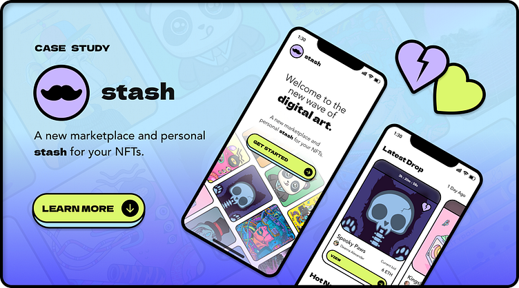
"Stash" Case Study
Overview
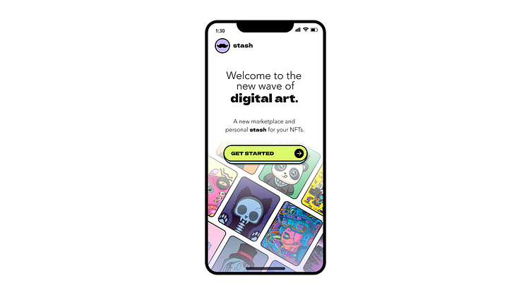
Stash an imaginary solution, for an imaginary crypto startup - created as an assignment for part of Dribble’s Intro to UI Design Course. Using Figma for my tasks, the final project included building a UI Library, creating a functional prototype, and this case study you’re ready now! Stash allows users to immerse themselves in a striking, in-your-face, curated marketplace, where they can buy, sell, and create digital art.
Design brief
Establish the visual language of a new NFT marketplace app that is ready to revolutionize the digital art scene. Lock in a strong visual aesthetic and then scale the design on multiple screens, based on the wireframes and the flow that is provided from the client. Build a UI Library for the final UI and create a functional prototype.
Action
Create 3 mood boards
Design 3 visual explorations
Design 5 high-fidelity screens
Develop a design system
Create a prototype
Create a case study (you’re reading it!) :)
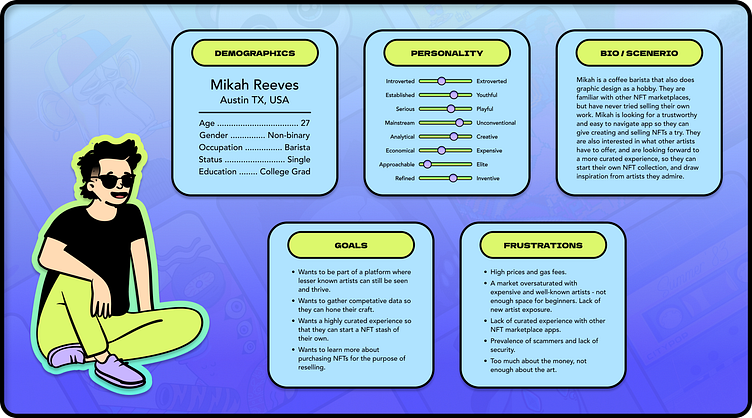
User persona
My user persona, Mikah, was based on the client's brief and the audience they are looking to serve. Mikah's motivations are built around embracing innovative tech in combination with their strong sense of visual aesthetic. Mikah is tech savvy, knows their way online, and even knows a little about crypto and NFT already!
They believe they should be able to buy, sell, and create digital art on a trustworthy and simple to use platform. They’re also looking for a highly curated experience - they already know their way around the crypto world, but are interested in finding new up and coming artists they might not have heard of before!
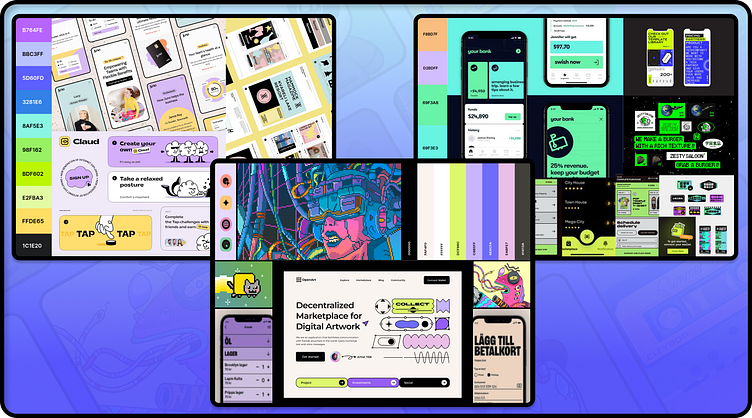
Mood boards
Given the user persona motivations, personality, and the visual direction provided by the client, I began started planning collecting images for mood boards. This was to help me gather inspiration from similar apps, and also learn what to borrow from, avoid, or change, when it came to building my design system.
I decided to build 3 different mood boards with clear visual directions, but allowed myself to borrow from rejected mood boards for features I still loved during the exploration phase. Mood boards are not meant to be perfect, just a quick way to research competition and draw inspirations from similar apps and relevant artwork.
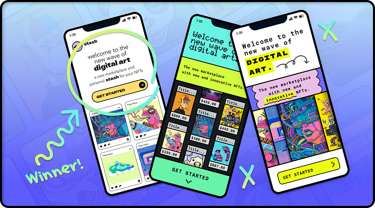
Explorations
After creating my mood boards, I went on to build several splash screen versions for each of my three mood board options shown above. My mood boards had slightly different color palettes but all of the concepts were bright, and quirky. I couldn’t rely on color alone to help me make my decision. Because of this I leaned strongly into different uses of shape and typography for each draft.
My first approach had a bit more whitespace, allowing enough room for elements to breathe. I used rounded buttons, cards, and iconography to stay consistent throughout. This approach has a nice balance of bright vibrant colors, pastel colors, and effective use of whitespace. This is ultimately the option I chose in the end, with some minor adjustments and further exploration.
My second approach has a more pixelated fee, and used only sharp corners, a total 180 from my first approach. Even my choice in font I selected due to inspiration from pixel art, and a strong digital aesthetic and message. The color choices in this design are a little brighter. Although all these designs contain bright colors, this version by far is the brightest, where others have some pastels mixed in. I ended up rejecting this version because the end result felt a little too crowded, with not enough breathing room, or focus on the content. The CTA did not stick out as it should have. I did still end up using this version as some inspiration for altering the color palette of my first design.
My last approach used a mixture of rounded, harsh corners, and organic shapes. I actually really loved this design, and almost chose to move forward with it, but decided it felt a little too disconnected. Too much was going on, and I needed to make a choice between using sharp or rounded corners. I ended up rejecting this version as well, but also decided to borrow from this color palette for my final design. you might have noticed, I also took some of the nice organic hand-drawn shapes and arrows and used those to jazz up my case study!
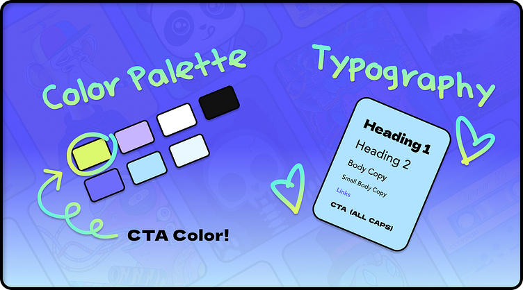
Typography and color palette
For my final splash screen direction, I decided to stick with the general look and feel of my first exploration, but wanted to play around with the colors. I kept the muted purple as a primary color, but decided to switch to a yellowish green with a little more “pop” for my CTA. I also picked out a nice accompanying light baby blue for secondary button actions.
As far as typography goes, I wanted to keep in simple. I chose only two main fonts for different sections of the page. For top level headings and the CTA I used the font Dela Gothic One. This font is more graphic and catches attention easily. For all other information on the screens I used Avenir in various font weights and sizes. All copy throughout the app is black, with the exception of links. For links I also used Avenir, but chose to go bold, and change the color to a dark periwinkle to set them apart from the rest of the text. Both font selections are sans-serif fonts.
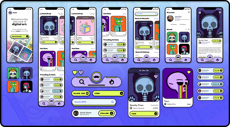
Design considerations
Now that I had decided on my final design system and created my initial splash screen, I still needed to further refine the splash screen and start considering what my other functional screens might look like based on this system. Other screens I needed to adapt to this design system included:
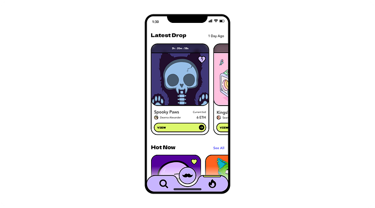
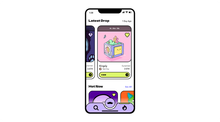
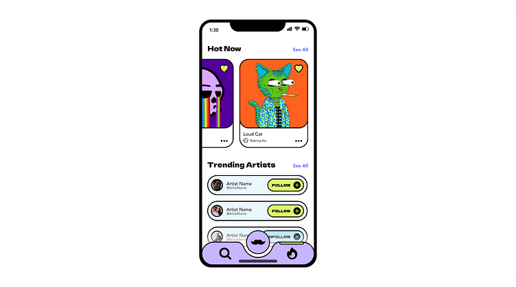
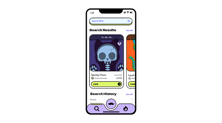
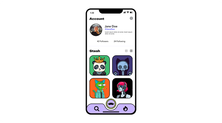
Home screen
Search
User profile
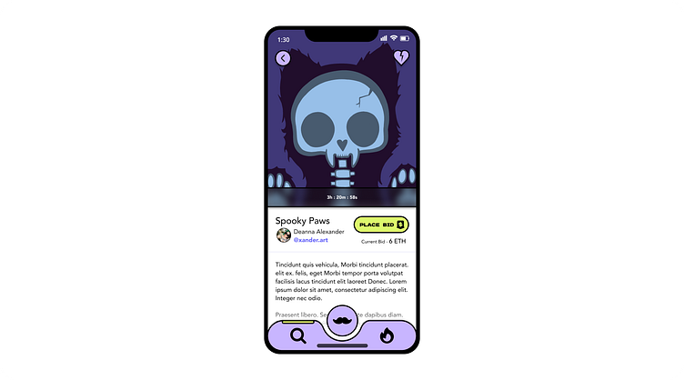
NFT view screen
In order to do this, I would also need to start defining and refining reusable components on each screen, such as:
CTA button(s)
NFT card(s)
Profile Images
Bottom Nav
Icons and other details
Results
Delivered design several design explorations and tracked my progress
Created a new visual language
Designed high-fidelity UI screens
Created UI library with type styles, color palette, components, and modules
Created a Figma prototype
Created a case study! ;)
Reflections
I’m a graphic designer in my day to day, and a full-stack web developer bootcamp graduate. This class and assignment were both such great learning opportunities to tie together two different aspects of my life I’m very passionate about in a meaningful way. It’s really neat to get to experience a full cycle of an idea, and see it really come to life. I really appreciate getting to learn about atomic design, and seeing how each little thought, consideration, component, sometimes down to the very pixel, all come together to create a product with consistent design standards. I really hope to continue my UI journey and turn this into a career as I continue to learn and grow.
Due to time constraints and prioritizing my current career, I did not get the opportunity to create a functional prototype or demo to include with my case study. I think my final app design is very strong, and I’d have loved to be able to provide an interactive prototype to help others visualize its capabilities.
I hope to be able to revisit my design soon, and continue to learn and make improvements. I plan to update this case study to include functional prototypes when they are finally ready.
I also noticed that as I ran short on time, my Figma file layers began to get messier and messier. As a graphic designer and illustrator, this is something I’m already all too familiar with. I like to try my best to stay more organized, but I also like to be real and honest about my work and any struggles I come across. I know this is an issue many of us have suffered from and I'm not ashamed - but take it as a learning opportunity.
I think by staying more organized and making sure to name and restructure my frames and layers from the beginning, I will save myself more time in the long run. I believe this will make it even easier to create a functional prototype and demo and really showcase my hard work. I am still glad I learned this lesson the hard way, because now I know what to look out for next time!
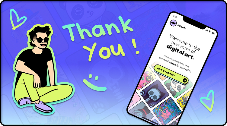
Thank you!
Thank you so much for taking the time to read over my case study. I hope you enjoyed walking through my thought process and joining me on this exciting journey. As always I am open to work and open to any and all feedback.