NFT Marketplace Visual Design

PROJECT BACKGROUND
This work is the result of Dribbble's 3-week assignment in their UI Design Class.
The Brief
Design an NFT Marketplace app based on the wireframes provided.
My Role
Product Designer
My Team
My world-class cohort of 10 design fellows and 1 amazing Mentor: Ana Santos
Time Spent
Outside of Group Sessions: 60-55 hours
DEFINITION OF DONE
Design 5 key screens and a UI Library.

THE PROCESS
WEEK 01
Early Research & Visual Design Exploration
Activities
Kick-off
Market Research
User Research
Visual Exploration & Moodboards
Design Directions
Design Critique
Kick-off
Design Research & Moodboard Session
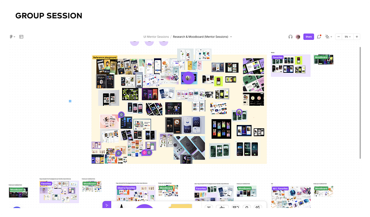

As a class, we shared our collective visual design research with each other in a 45-minute Figjam session.
Initial Takeaways
Glass surfaces, abstract liquid forms, blur-effects, soft mesh gradients, and quirky typography were all popular in our session.
At first, there was a strong inclination to lean towards a clean, white UI that would frame and showcase the NFT artwork and pop the call-to-actions, making for a more intuitive app experience, but would it be enough to help the brand stand out in an increasingly competitive space?
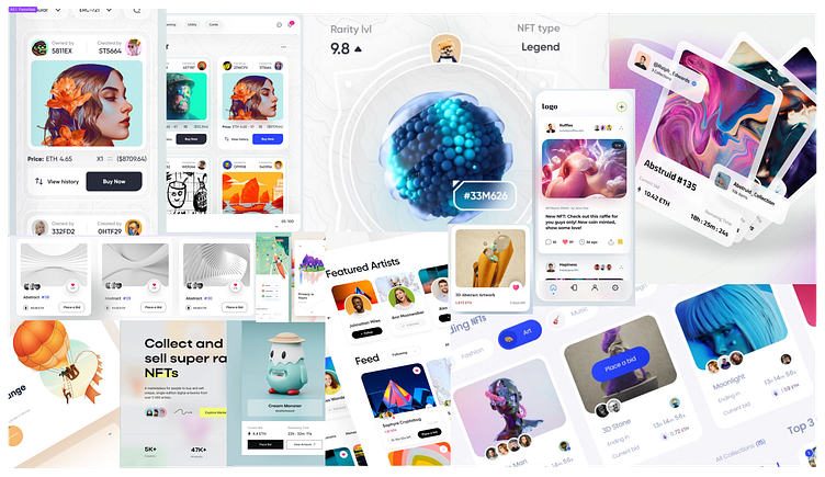
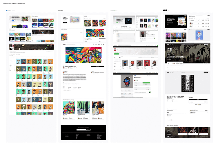
Market Research
Competitors & UI Trends


User Research
Initial Persona Profiles

Investors & Collectors
For the purposes of this project, we developed initial profiles based on secondary research and to primarily focus on the Investor and Collector needs at a high-level.
As a point of clarification on the User Flow, all NFT marketplaces require a cryptocurrency wallet of some kind, so we are assuming the User already has their wallet and account setup.
Visual Exploration
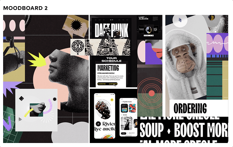
Playgrounds & Moodboards


Design Directions
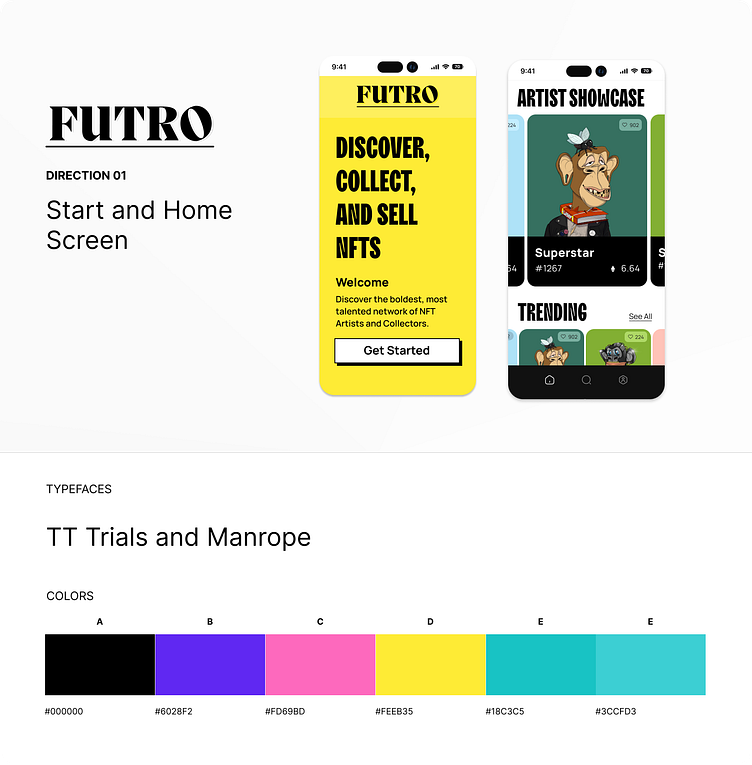
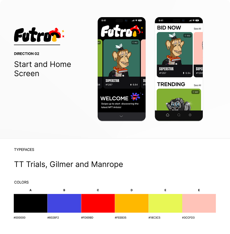
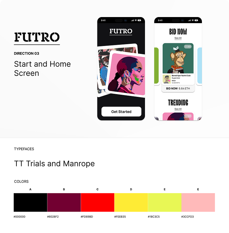
Splash & Home Screens
Design Critique
Feedback
Love
• the typography from Direction 1
• the playfulness of Direction 2 (though possibly not the right fit for Investors and Collectors)
• the cleanliness of Direction 3
Continue
• exploring the branding in Direction 3
• exploring Direction 3's card treatment with the CTA treated so prominently
Caution
• Interesting "swipe-up" use on Direction 2 – how will the overall navigation work?
End of Week Summary
Deliverables
• 2 Distinct Moodboards
• 3 Design Directions
Design Criteria
High brand impact on Splash
High NFT impact on Home
Home is easy to navigate and highly actionable
UI Framework is intended for personalization (tailoring content to user preferences and behavior is key)
Design Decisions
Out of scope: Account Setup, Onboarding UX, Sign-In Flows or Wallet Setup
THE PROCESS
WEEK 02
Refining & Scaling the Design
Activities
Design Feedback Incorporated
Brand & Design Direction Refinement
Prototyping
Design Feedback Incorporated
Splash & Home Screens
Brand & Design Direction Refinement
Splash & Home Screens
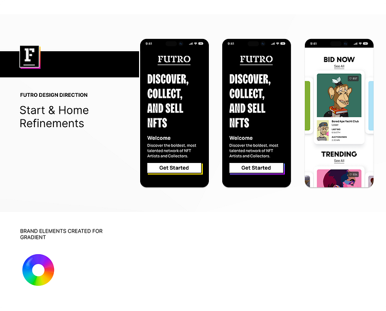
Splash Screen
Exploration of brand treatments to increase brand impact

Above are various splash screen iterations – the one on the far right is entitled "Ray Eames meets NASA".
Splash → Home Screen
Exploration of the brand banner treatment when in proximity to Cards

Home Screen
Exploration of Portrait-Oriented Cards to Showcase NFTs

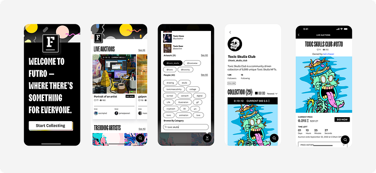
Splash → Home Screen → Search → Profile → NFT Detail
Exploration of the User Flow
Home Screen
Exploration of Navigation Treatments

Home Screen
Exploration of Landscape-Oriented Cards to Showcase the people behind the NFTs

Prototype
Continuously evolved over the course of the week to inform design choices
Check the Prototype out for yourself!
Design Critique
Feedback & End-of-Design-Phase Reflections
Love
• the branding on the Splash Screen - "...nice and bold! Which is a great teaser for what's to come inside :)"
• the typography feels playful and clean at the same time
• the various cards make it feel exciting and inviting
• the countdown isn't too in your face but still cleverly pops on the detail page
Continue
• exploring how to pull more of the brand elements from the splash screen into the app
Caution
• the icon treatment in the navigation feels like it needs more refinement, would definitely test it in a usability study
END OF WEEK 02 SUMMARY
Deliverables
• 5+ Key Screens
• 1 Design Direction
• 1 High-Fidelity Prototype
Design Criteria
√ High brand impact on Splash
√ High NFT impact on Home
√ Home is easy to navigate and highly actionable
√ UI Framework is intended for personalization (tailoring content to user preferences and behavior is key)
THE PROCESS
WEEK 03
Polish, Document & Package
Activities
Design "Clean Up"
• Check Screens for Alignment & Consistency
• Check for Usability and Accessibility
• Check Components, Styles & Treatments
Document Design
Publish UI Library
Check the UI Library out for yourself!
END OF 3-WEEK PROJECT SUMMARY
Deliverables
• 2 Distinct Moodboards
• 3 Design Directions
• 1 Refined Design Direction
• 1 High-Fidelity Prototype
• 1 UI Library
Key Learnings
Don't skimp on the visual design exploration! It's not only fun but is also an invaluable foundation come time for making design refinements later on in the process
Wireframes can be good guidelines, but design feedback from Users is the best form of input or source of inspiration – it was a hugely missed aspect of this process as was a team collaboration
While the brand banner was promising, in the end, it detracted time and focus from refining the navigation model, icons and UI animation details that were on the nice-to-have list for this project
Thank you!
I truly appreciate your time and hope you enjoyed this case. Please show some love and like this case or DM me if you have any questions or queries.
