UI Design: Moon's Intergalactic NFT Marketplace
Overview: Taking a trip to the Moon Marketplace
Mission Brief
I completed this project for Dribbble's 4-week UI design course in the Fall of 2022. Our mission (should we choose to accept it) was to research, create and scale a design direction for Moon – a new up-and-coming startup with the goal of revolutionizing the NFT marketplace with a deeply curated, design-first experience for their users.
Mission Objectives
Our goal was to establish a visual language that would match Moon's mission to revolutionize the digital art scene. The challenge was to lock a visual aesthetic in a short period of time and create a scalable design system based on the wireframes and basic flow supplied by the client. In the process, we'd build a UI library and create a functional prototype.
The Solution
The design direction I landed on leans hard on Moon's name and takes the user on a trip straight into deep space. I wanted the experience to feel dark and futuristic, balanced with warm glowing features and dreamy, surrealist imagery to hint at otherworldly life forms or even a future version of our own reality. Different, yet familiar.
Initial Stages of Exploration
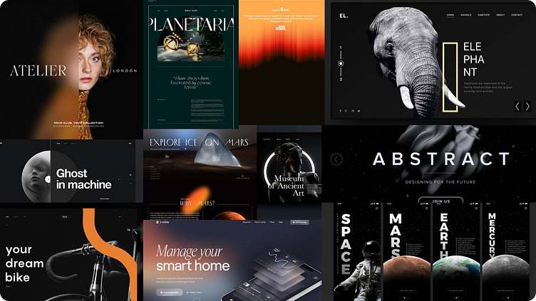
I started the process by doing some general research on existing NFT marketplaces. In general, I found some consistent themes – existing platforms for NFT art tend to use a lot of sharp edges and bold colour gradients, as well as 3D and virtual elements to create a technical and computer-generated feeling.
My initial instinct was to go in the opposite direction – to create a different kind of NFT marketplace, inspired by in-person art exhibits, gallery walls, and traditional graphic design elements. I explored a vintage-feeling visual direction that used beige-toned backgrounds with bold typography and pops of colour to create a feeling of subtle sophistication and art history.
Mood Board 01 – Light, colourful and artsy
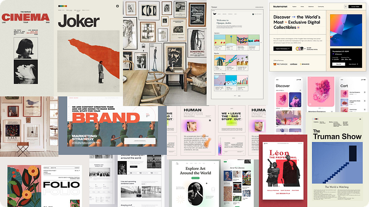
Visual Direction 01 – Vintage art gallery vibes
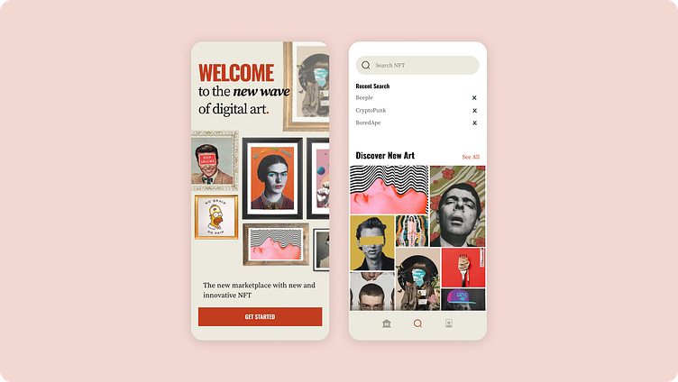
Initially, I was drawn to this direction and really enjoyed playing around with the idea of displaying digital NFT art in traditional "wall-mounted" picture frames. At the same time, I was curious to explore a darker colour theme that struck a better balance between NFT art's intrinsically futuristic feel and my own inclination toward aesthetics that are simpler, softer, and human-feeling.
As I explored other approaches, I thought about the client's name – Moon – and found myself drawn to simple images that balanced deep black backgrounds with bright flourishes of colour – like a dark solar system dotted with colourful stars and planets.
I wasn't excited by the busy, colourful and technical feeling that NFT images sometimes evoke. Instead, I wanted to explore a direction that felt more like being lost in space – futuristic, dreamy images blended with dark simplicity. I hoped it would strike a balance between feeling fun and sophisticated; futuristic but familiar.
Mood Board 02 – Dark, Sleek and Spacey
Visual Direction 02 – Intergalactic World Tour
As I pulled together the second mood board and played with some initial visual exploration, I knew I'd found the winning design direction. I loved the deep space feel and the way the black background enabled a simple colour palette and creative visuals to pop on the screen.
Refining and Scaling
After settling on a direction, it was time to refine my designs and create a scalable system I could apply to all of the wireframes supplied by the client.
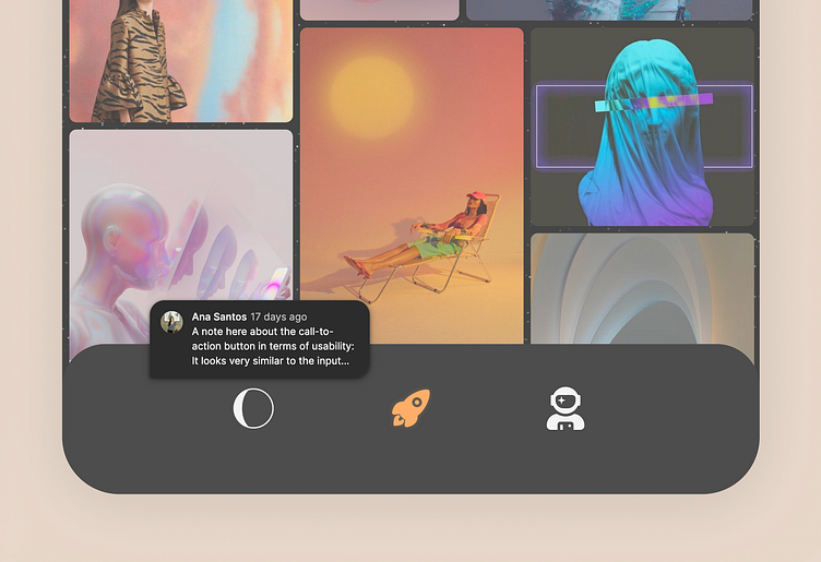
To decide on my final direction, I'd already completed some initial designs for the splash screen and home page of the app. I continued to refine the elements on these screens, drawing on the feedback I received from my mentor and classmates from the UI course.
As I began to lock in my designs, I started the process of creating an organized UI library to ease the process of scaling the designs to other pages. I established a clear hierarchy of typography and colour, and created components and modules to keep things organized as I continued to iterate and apply the designs on new screens.
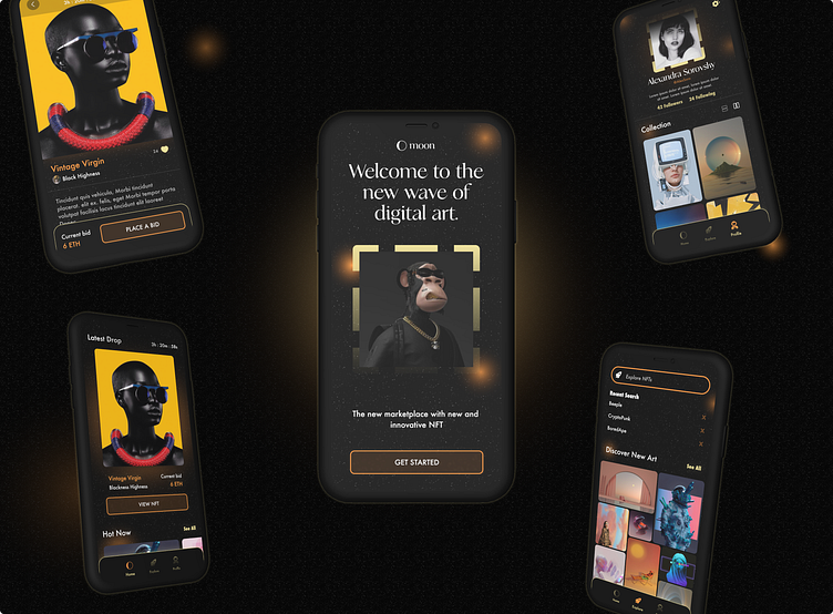
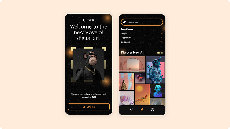
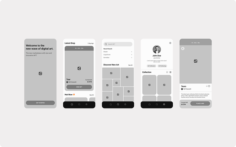
Final Designs
In the end, I designed 5 screens for Moon's NFT marketplace:
Splash screen
Home page
NFT closeup
Explore page
Profile page
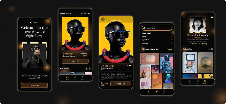
After tightening the designs and finalizing my UI library, I put together a prototype to highlight some of the simple on-screen interactions. I also had fun playing with some other approaches to mocking up the screens.
Moon NFT Marketplace Prototype
Group of phones – simple animation
Conclusions
Overall, this was a really fun project – from initial concepts to a functional design system and high-fidelity mockups in Dribbble's 4-week UI design course. I spent a lot more time finessing different elements than I imagined I would, and came away with the feeling that the process could have stretched on forever. I'm happy with the end result and would have loved to spend more time adding depth to the prototype and exploring additional page designs.
I really enjoyed the course and came away with a new respect for the design process. As a designer, I often want to skip right into "the fun part" and get designing right away. The course demonstrated the value of taking your time with research and exploration, drawing on inspiration from multiple sources and constructive feedback from peers and mentors. It also showed how important it is to spend time building a strong UI library that helps keep things organized and efficient while you're designing, and beyond.
Acknowledgements
Thanks for stopping by and taking the time to look at my work! If you have any thoughts, questions or feedback, I'd love to hear 'em.
I'd also like to thank my mentor for the course, Ana Santos, and my skilled classmates who gave great feedback along the way and inspired me week after week.
Lastly, thanks to the many artists on Pixels, Pinterest and Dribbble – without whom I'd never have been able to bring my designs to life!
