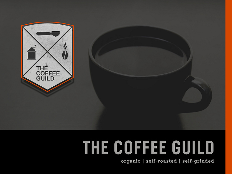
The Coffee Guild
Summary Client Brief
Logo Design:
professional look
cool, trendy, authentic
easy to adapt to products, especially mugs
„Beeing able to see our logo on the coffee cup before we commit to a design might be nice.“
avoid competitors color (green)
„We love the idea of the guild name as an associate of craftsmen in our case freelancers.“
Mission Statement:
Our goal is to provide a safe and warm environment for those seeking a place to work and meet together for business or for conversation.
USP:
focus on coworking, freelancing
high in quality coffee, self-grinded and -roasted
Target Group:
freelancers, start-ups
younger crowd, 18-39
Solution
As a starting point I researched some former guild badges to make sure I achieve that crafty guild look. That lead into the overall shape of the logo mark and the choice of different coffee house related symbols.
To clean it up, I waived the ornaments stuff you find in former guild badge designs, what lead to a more modern look. To further emphasize the crafty look, I added a texture to the logo design as an option.
The Color Palette is simple and clean. Orange was chosen to add an engaging signal and some warmth.
Presentation
As required I presented the logo design on a coffee mug, which turned out pretty well.
When I decided to do another sample application, I added a warm yellow to the color palette, to further emphasize the creative and welcoming atmosphere we aimed for.


