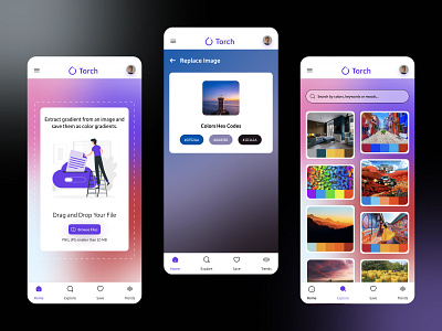
Gradient Generator App
Hello Dribblers,
We love a good gradient for projects that want to give a bit of an edgy and hedonistic vibe. Achieving a gradient that fits the project and meets the accessibility requirements can be tough though. Here are some tips and tricks we use to get the right fit:
1. Choose the colour palette and define the spectrum. Should be cool colours, warm colours or a blend?
2. Keep the font colour either white or black depending on which one meets the contrast ratio.
3. Check the contrast ratio of the font colour against each of the colours used in the gradient. We like to use the Adobe contrast analyzer tool to ensure we meet accessibility requirements.
4. Adjust the colours in the gradient to make sure visibility is not compromised. It's important that we design inclusive products so they're accessible to all.
For more design titbits, follow our journey on Dribble! Got questions?
Email us at hello@unpause.xyz to say hi or chat about your next big idea!
