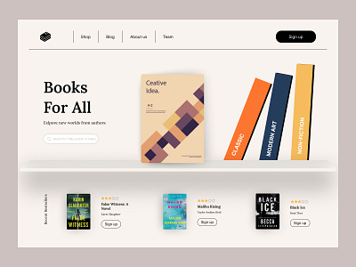
Digital Bookstore
While the landing page seems simple, classic and clean, we'd like to point out the importance of drop shadows in this UI design. The goal was to add depth to flat 2D objects and drop shadows helped us achieve this. The smallest tools and tweaks can often make or break a design.
We're always up for a challenge and we love solving complex problems through design thinking.
Reach out to hello@unpause.xyz to collaborate on design projects!
More by Unpause View profile
Like
