Noodle | Home screen case study
A few months ago we decided that our home screen was too small for our family of products. So we decided to do a complete remodeling. Focus on navigation and accessibility, the new home screen is built to make everyday tasks easier and more reachable.
Main navigation
Now we are focusing on Financing, royalties share, exchange and education. We made tabs dedicated to each one of those. Easy to reach and always available to the user.
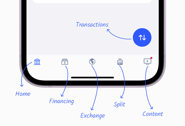
Transactions button
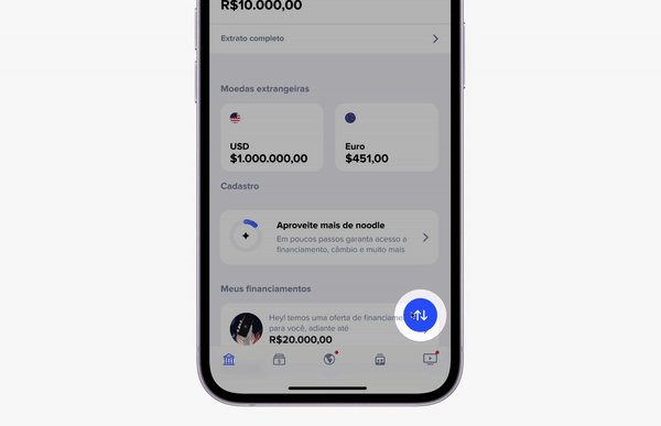
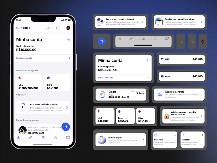
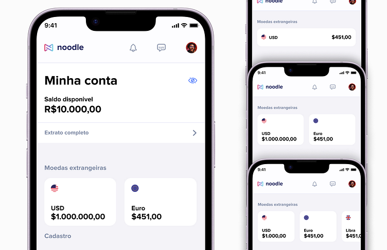
More money more problems
Now we are able to accept over 60 different currencies. The main one, Brazilian real, it's on top, in the balance card. Most of our clients work with 2 or 3 other currencies, so we made a scalable component that fits 1 to many cards, optimizing the home screen's real state usage.
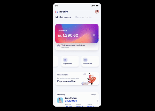
One step forward gamification
In Brazil we have hundreds of digital banks, so competition is hard. We are working on score system to engage the user to use our account, access financial products, and give as much data as possible.
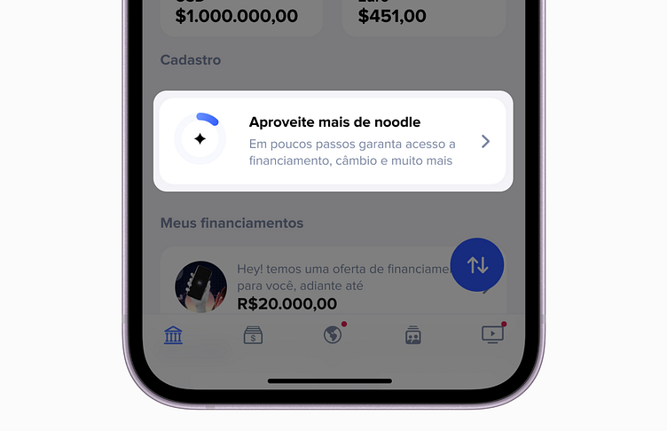
This card invites the user to enjoy the best of noodle and it's always at the home.
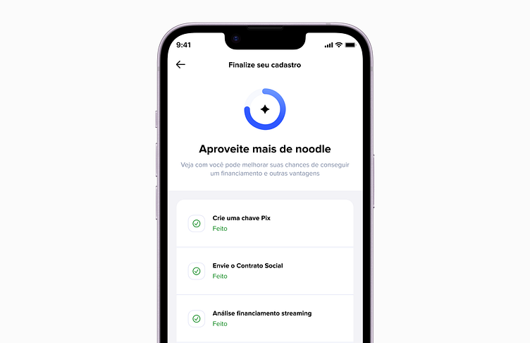
Inside this screen, we encourage the use to complete simple tasks, as fill some additional infos, send documents, asks por a financing proposal. In the near future we are making this even more game-like with levels, badges and rewards.
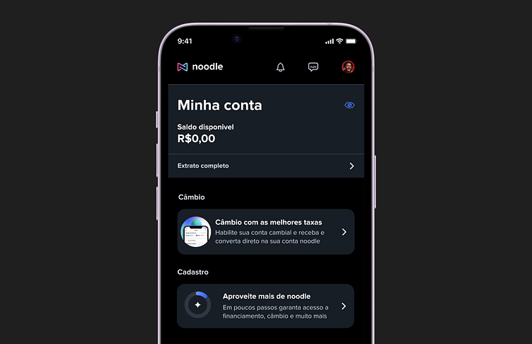
One more thing... Lights out
I'm, not a dark mode user but I read an article that said around 80% of the users use dark mode. We remade our color library to support dark mode with no effort at all. The app changes the colors based on the OS preferences