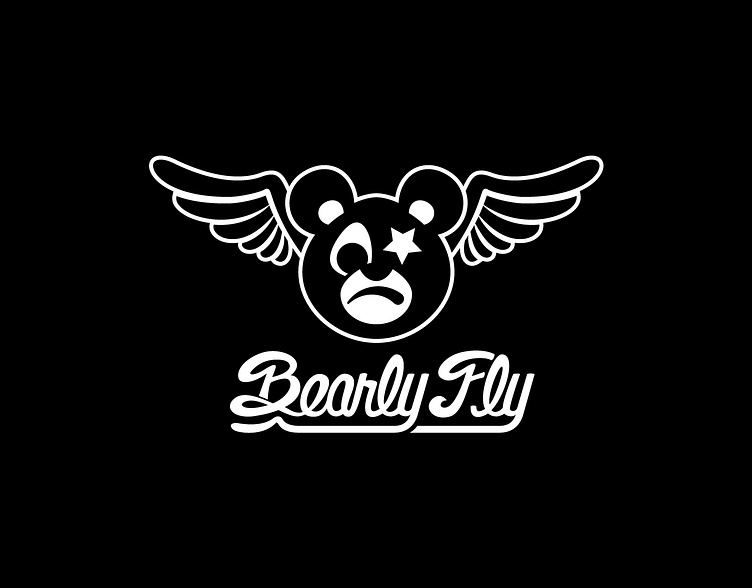
Bearly Fly Logo and Wordmark
Bearly Fly is a lifestyle brand dedicated to those who achieve their goals despite the obstacles in their path. The primary goal with Bearly Fly was to build a sustainable long-term brand that inspires people to persevere, gives back to worthy causes, creates community, and engages in responsible and sustainable manufacturing practices. The inspiration for the brand was derived from the founders passion for sports, music, and art.
The name Bearly Fly came from the idea of turning a negative into a positive. The term ‘barely fly’ holds a negative connotation, while switching up the letters gives you Bearly Fly, a mentality that fuels you to persevere through anything. The brand is also dedicated to promoting fair treatment within the apparel industry, and for that reason we sought out and connected them with suppliers and manufacturers that meet certain international production and wage standards.
Logo
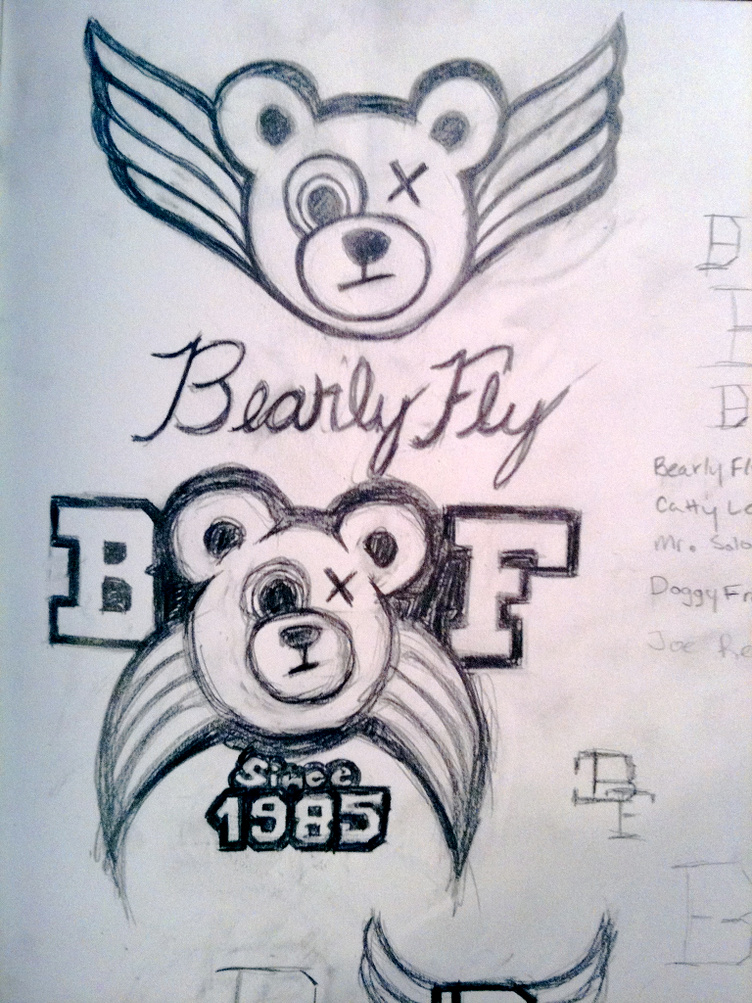
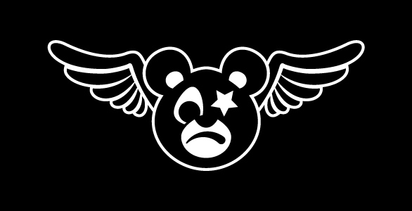
When it came time to design the logo for Bearly Fly, the goal was to create a character that could represent the brand and allow the development of a further narrative. By creating the bear character, it provided a vessel to assign traits and tell stories, and draw people in.
Since the brand was meant to celebrate our imperfections, I was drawn to the image of a teddy bear with a missing eye. It was an idea I knew would connect with a wide range of people as it communicates the idea of still loving and valuing something despite the bear losing a piece of itself.
Wordmark
For the wordmark, the goal was to create something playful, clean, and timeless. As mentioned previously, one of the goals with the brand was to create a sports team type feel. In sketching this out, I drew inspiration from many retro sports uniforms, particularly in baseball and basketball.
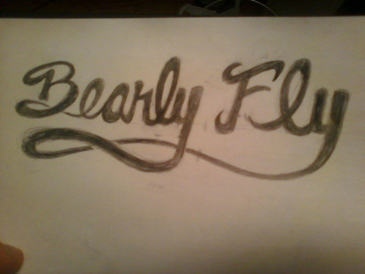
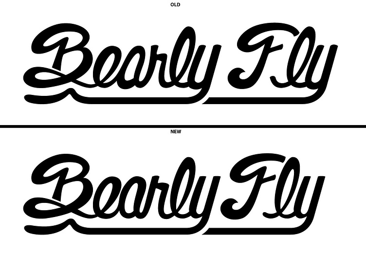
When creating the original version of the script from the sketch, I realized some pieces needed to be cleaned up. The swooping underscore was removed and simplified. I pulled a piece of the wing from the logo and connected it to the end of the underline to add some style. While the hand-drawn feel of the first version had some whimsy to it, it, it felt off. I went back and recreated each letting again to bring uniformity across the wordmark.
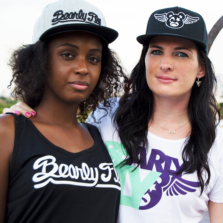
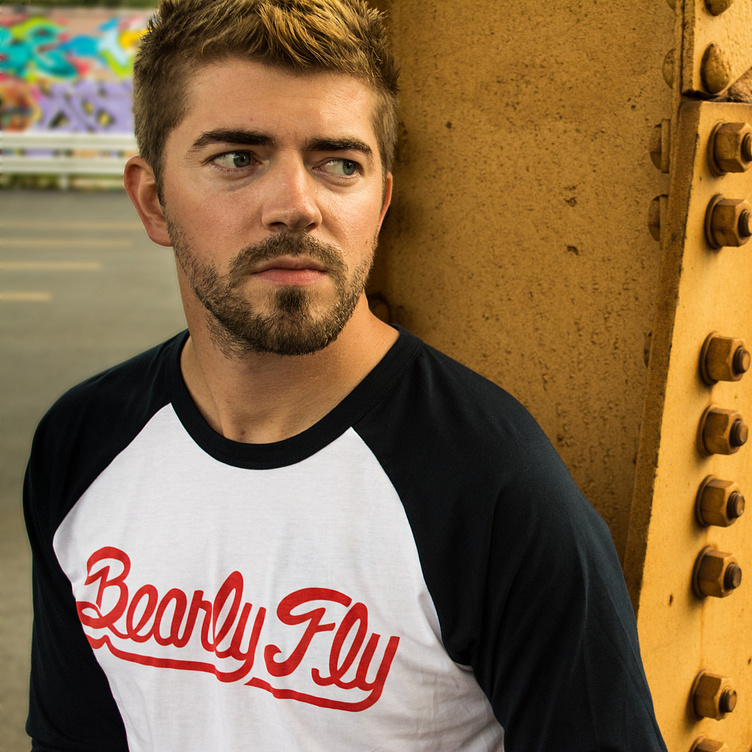
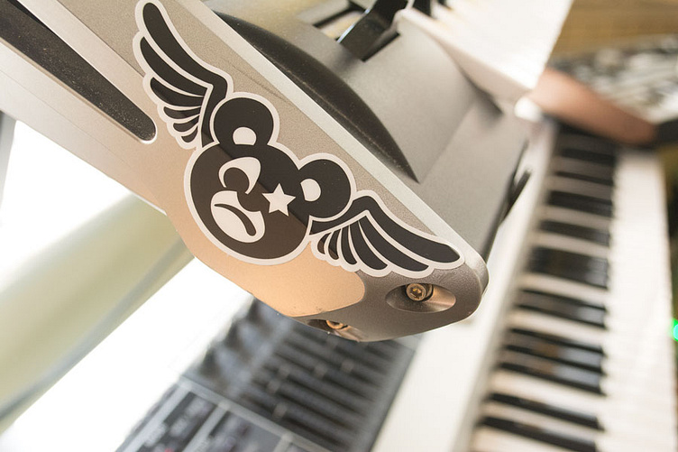
In Use