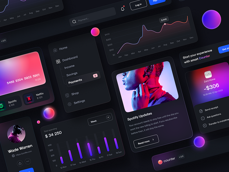
Counter. Banking app. UI elements
About project 🚀
Hi everyone! 🤗
I want to share with you my latest concept for a Banking app. I am keen on working with components and details because they are the base of the design.
I tried to use bright colors and gradients to make the banking app not so dull. And of course, I spent a lot of time searching for the correct font. Grotesk with round letters has the right coin vibe.
Don’t forget to share your love ❤️ and feel free to give some feedback.
If you don’t want to miss other concepts or projects – follow our Gotoinc team and me 😊
Have a project? Let’s chat - 📪 hello@gotoinc.co
More by Gotoinc View profile
Like


