Abuse Attention
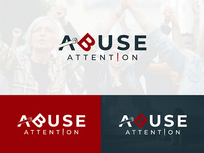
I design this logo for one of my client from Somalia.
There small group of people Abusing in Church by large number of
people from others religion. Now they want to together that type of
people who are abusing in church.
I design this logo creative way. I develope my concept this way the letter “ A ” abusing the letter “ B ” .
The letter “ A ” hit the letter “ B ” and the B letter fall to down . I think this is abusing.
The color i use red and gray because of red represent Dominance, Power, Aggression, Danger and Warning.
The color gray creates sadness and depression and a tendency to loneliness and isolation.
This color emotion psychologically represent the people mind more aggressive, more dominant, and more likely to physical
abusing also use for people attention.
Hi, My name is Hasan. I am Professional Logo Designer. Are you Looking a logo design for your business? Contact in WhatsApp (+880 1869 622 108)
