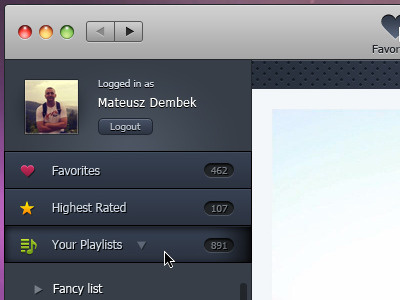
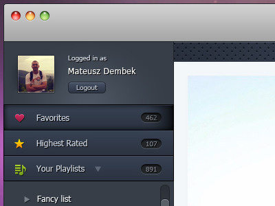
YouTube player for MacOSX ui (second version)
I makes changes from the feedback of forrst and dribbble and came to me something like that. I think now it looks much better. So thank you all for your good advice and suggestions. Nevertheless, I'm still open to comments and suggestions about the design of this application ;)
More by Mateusz Dembek View profile
Like


