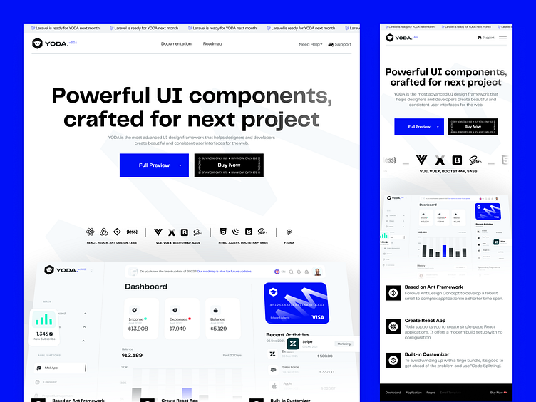
YODA - Landing Page
We analyzed and reported the first versions of the landing page in terms of user experience, then we constantly renewed and improved it according to the data obtained.
We created a persona group from users who opened a ticket to our support team. After the persona and customer experience mapping studies, we designed the new interface of YODA by performing structural categorization and site navigation improvements.
In the 2-month period since the release of the new interface, according to the data from the same period of the previous year; There was a 55% increase in targeted mobile conversion rates and a 180% increase in conversion rates from landing page to Envato.
The YODA Team, which sells products to 100+ countries, also brings its users together with the UI Kit and Design System with its extraordinary works on Figma.
Stay tuned, YODA has more to show⚡️.
We would be very happy if you share your comments with us💭.
Take care people!


