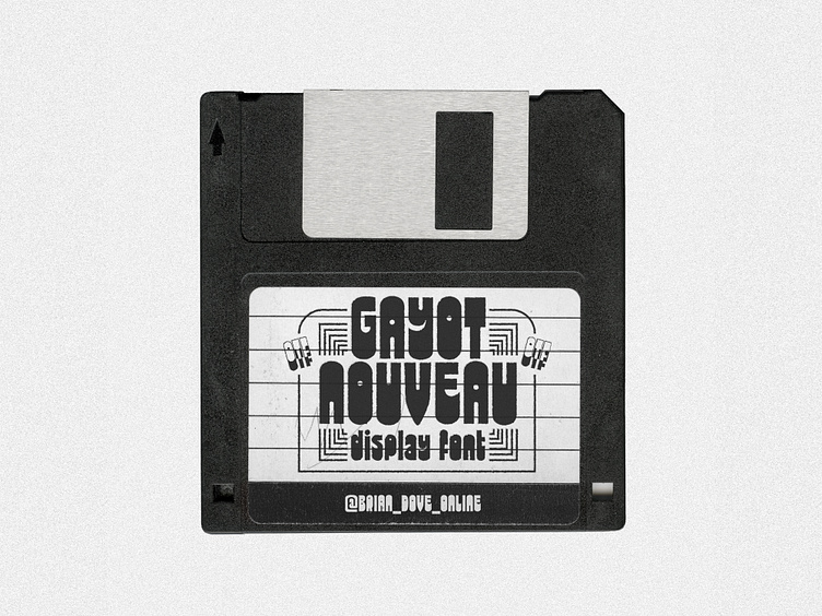
Gayot New - Display Font Coming Soon
Putting the finishing touches on this bad boy that I'm calling Gayot New (I was gonna call it Gayot Nouveau but it is not Art Nouveau-y, nor am I French, but I already made this floppy disk graphic before I made that decision so ¯\_(ツ)_/¯ whatcha gonna do.)
It is based off of Gayot, a lowercase display face designed by Jean-Pierre Gayot and released by Mecanorma, as dry-transfer sheets, as a winner of their type design contest in 1973. The goofy, tiny circular counters and uneven rhythm of the type caught my eye and I started doodlin'. Gayot New includes the addition of uppercase forms, wider proportions, and some other design decisions that lead me to hesitate to call it a "revival" of Gayot.
Gayot New will be released in early November through my studio Big Fog. The character set is Latin-Plus compliant, supporting over 200 languages. It is well suited for logos, short headlines, and other instances where you won't be setting a big block of running text.


