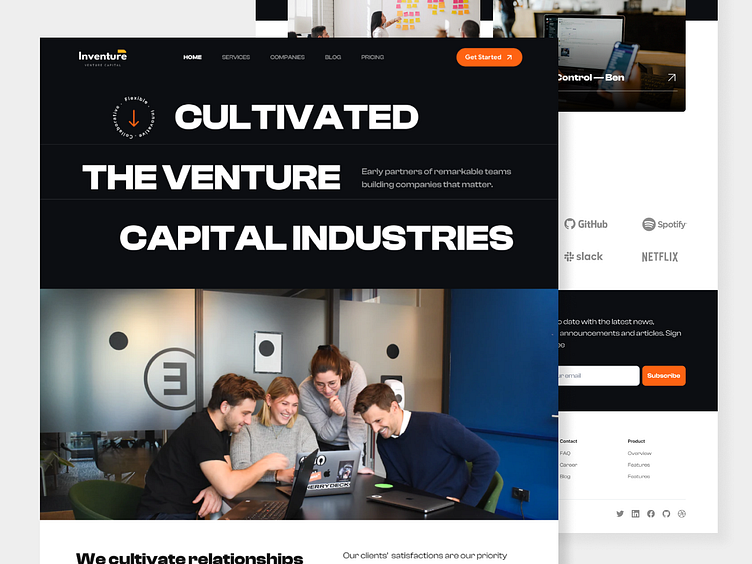
Inventure - Venture Capital Landing Page
Wireframe & Style Guide 🎨
In this process you can check quickly the wireframe that I designed below. After searching for some mood boards as my design references and researching for more than 3 websites. Also, you can see the style guide for this design.
Full Landing Page
Go further, you can check the high-fidelity version design below in this section. As you can see above this I namely choosing orange as the primary color and making the style clean and minimalist.
So, do you have any thoughts on my UI design?
We are available for a Venture Capital landing page website, Redesign startup websites, Venture websites, and similar niche app projects. Want to collaborate? Email us: hello@elux.space and visit our website elux.space
❤️ Press L if you like this project! We will appreciate any feedback!
Check us more at: Instagram | Website | UI8 | Creative Market


