NFT App UI Design Exercise
I decided to take a class to refresh my UI design skills and to continue to learn the in and outs of Figma. The following is the project I worked on for 4 weeks to better hone my skills.
The Brief
The brief I was given at the beginning of the project was from a fake
client called Moon. They are a new up and coming startup with the goal of revolutionizing the NFT marketplace business with a design-first approach
and a deeply curated experience for their users.
The objective of the project was to establish a visual language for this new NFT marketplace app. Once the visual aesthetic was set, I was to scale the design on multiple screens based off of a user flow and wireframes provided by the client. After the designs were scaled and set, I was to build a UI library and to create a functional prototype.
The target audience was all of the people that are embracing and/or following the world of NFTs and digital art. Mainly, tech-savvy people that know their way around crypto and NFTs. They have a strong visual aesthetic and a taste for curated and beautiful experiences.
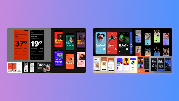
Step 1: Moodboards
I started off by pulling a bunch of references from various design inspiration sites like Dribbble and Pinterest. After filtering through those images, I created two buckets. One that was more flat and modernist while the other was more contemporary with slick gradients and rounded corners.
Step 2: Visual Exploration
From the moodboards, I started to pull elements and apply them to the Splash screen wireframe that was provided to me. I iterated on a number of designs for both directions before coming to the layouts below.

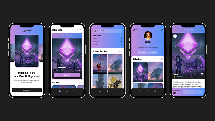
Step 3: Lock & Scale Design
Ultimately, I decided the more contemporary layout fit the brief the best and proceeded to scale that visual aesthetic throughout the rest of the provided wireframes. I tried to use a color system to pull the look of the app together applying a nice slick gradient wherever it made sense while leaving the digital
art to breath on top of a white background.
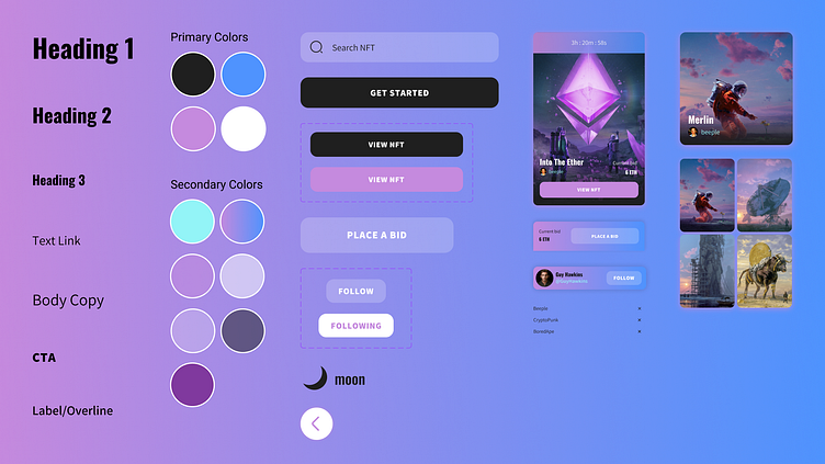
Step 4: Design System
While scaling the design across the wireframes I started developing a design system that a formalized after finishing the final designs. Style were made
for all of the typography used as well as primary and secondary colors. Also, components and modules were defined for further use down the line if at
any point I decided to develop even more screens for the app.
Step 5: Prototype
Finally, I pulled all of the screens together and used Figma's prototyping capabilities to make the user flow that was provided to me come alive. All of the interactions, from the page navigation to how the side scrolling galleries would function, were prototyped to give a better understanding of how this app could look if it were fully developed.
Conclusion
This was a great experience for me. It helped me remember how much I love creating UI designs and it gave me a lot of practice using Figma. I hope to create more UI design projects in the future.