Zoomsphere
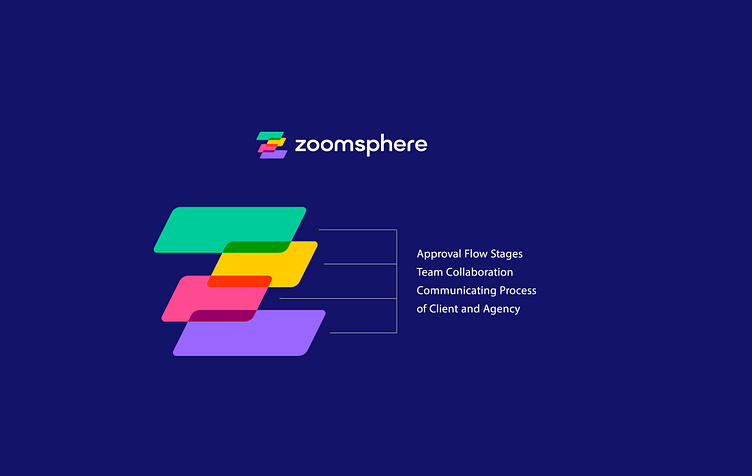
This design is crafted as an abstract logo, the logo is based on the idea of approval flow and team collaboration which is your priority to communicate.
I tried my best to come up with this logo mark that integrates stages of approval flow and its super relevant to your app and audience.
Please see it from the audience to understand it better. The overlapping shapes show communication of agency and on the other side client and all that happens in between is what you do.
It still looks Z letter but it is only possible because of it otherwise it will mislead people by changing their position making them another letter like S or E.
Typography is custom designed, and believe me, standard sans-serif font lasts longer than anything so we’ll work on that phase after the logo mark is chosen.
