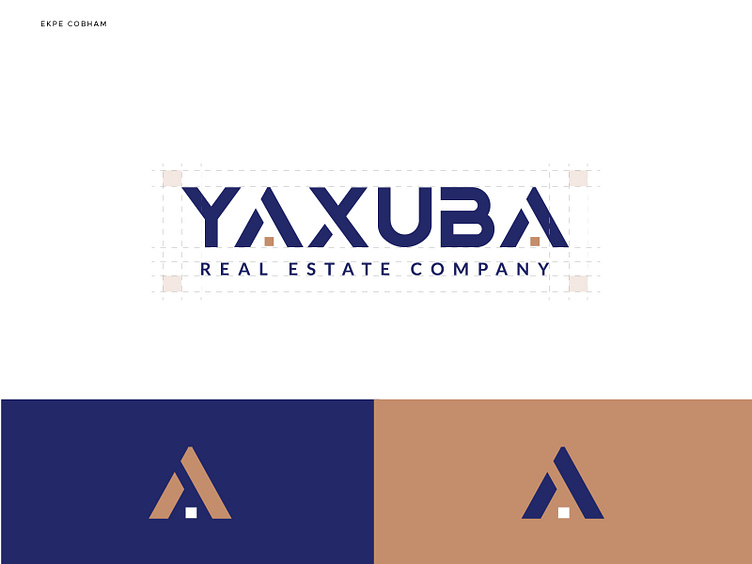
An Exciting Visual Identity For A Real Estate Brand
BACKGROUD
Yaxuba is a (architecture led design-build firm) real estate company that specializes on building luxurious apartments for people with good taste. They pioneer integration of technology and automation at the forefront of the development process. The brand’s values are integrity, reliability and professionalism.
CHALLENGE
Architecture has always been associated with complex drawing and calculations, and technology has been associated with “easy life”. How do we mix complex and simple, while also representing the complexity and careful thought process that goes into building a refined structure in a way that feels friendly and welcoming to people?
THE TONE
Yaxuba is a detailed and friendly brand, so it is important to instill trust and confidence in the heart of the users of the brand. Yaxuba’s tone is professional, friendly (jargon free), and genuine.
For every piece of copy I ask;
is it clear?
is it concise?
is it direct?
Keywords:
Luxury | Comfort | Technology | Convenience | Trustworthy | Secure | Masterpiece | Creative


