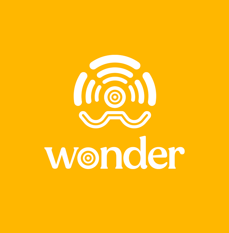
Wonder Logo
New logo I created for a fictional company called “Wonder”.
Wonder’s main goal is to provide their audience with monthly talks by specialists found within different fields, that deliver them valuable know-how specifically catered to their current wants and needs. After each talk a networking event will be held, which will allow the audience to further strengthen their own position within the market by making key connections with each other.
Thought process behind the logo:
The bottom part of the logo abstractly depicts the top part of a speaker’s body, talking to an audience, hands raised. The shoulders and arms are shaped in the shape of the letter “W”, the head in the shape of the letter “O”, the first two letters of the company’s name.
The 3x3 concentric lines above the abstractly depicted speaker, represent the arena/room in which the speaker is talking to his audience. These can also be interpreted as the soundwaves of the specialist, floating towards the audience.
The head of the speaker’s body is made to look like an archery target, because of the way in which the company aims to cater perfectly to their customers. They do this by continuously staying in contact with them through a variety of (social) media in order to fully grasp what it is they desire the most when it comes to valuable knowledge within their fields.
