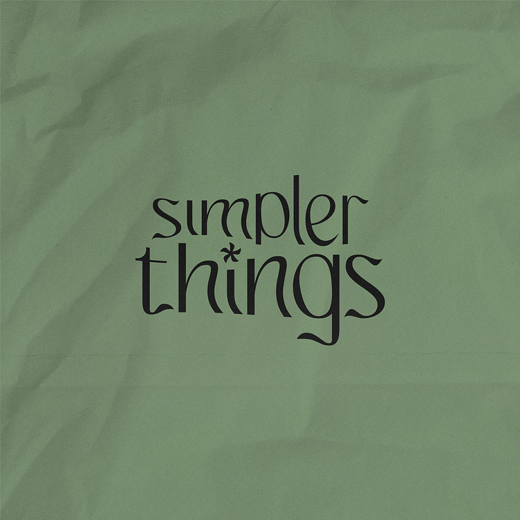
simpler things, coffee + croissant shop
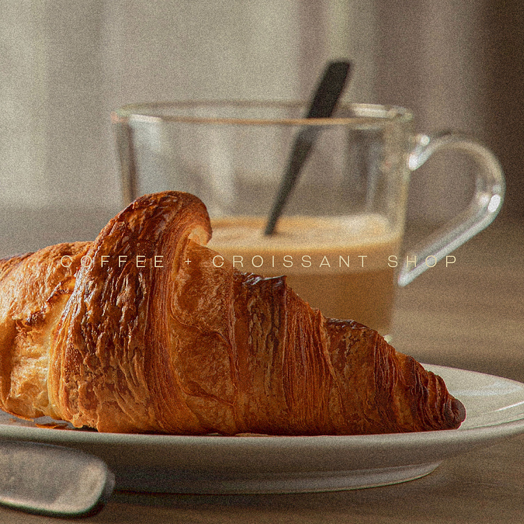
Out of necessity for a simple breakfast spot in Copenhaguen, simpler things arose. simpler things is a one-stop coffee + croissant shop that dilutes the current breakfast culture down to two things: a good coffee and an extraordinary croissant.
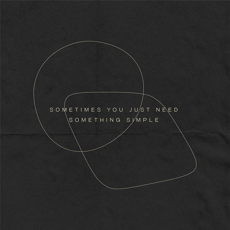
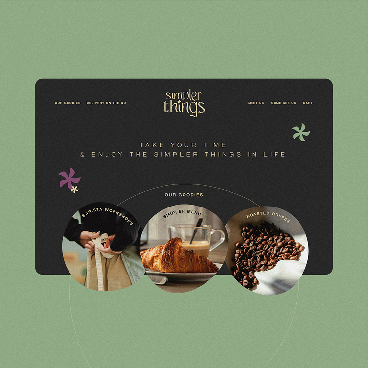
When a message is simple, it focuses on the important stuff. When your message is filled with unnecessary information, it mitigates the intention and takes attention away from the key point. Building on this basis, our challenge was to create a brand identity that highlighted the important elements of the brand: the coffee and the croissant.
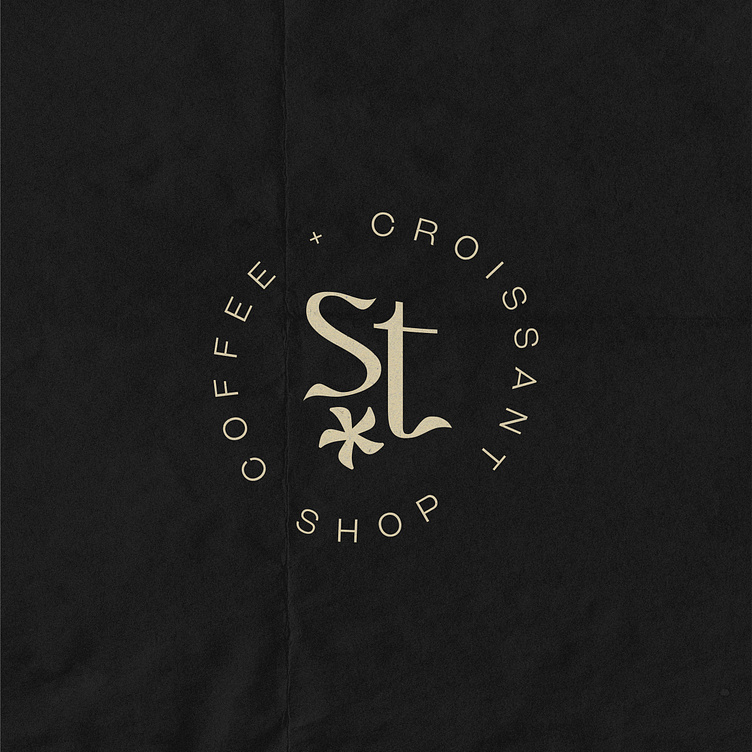
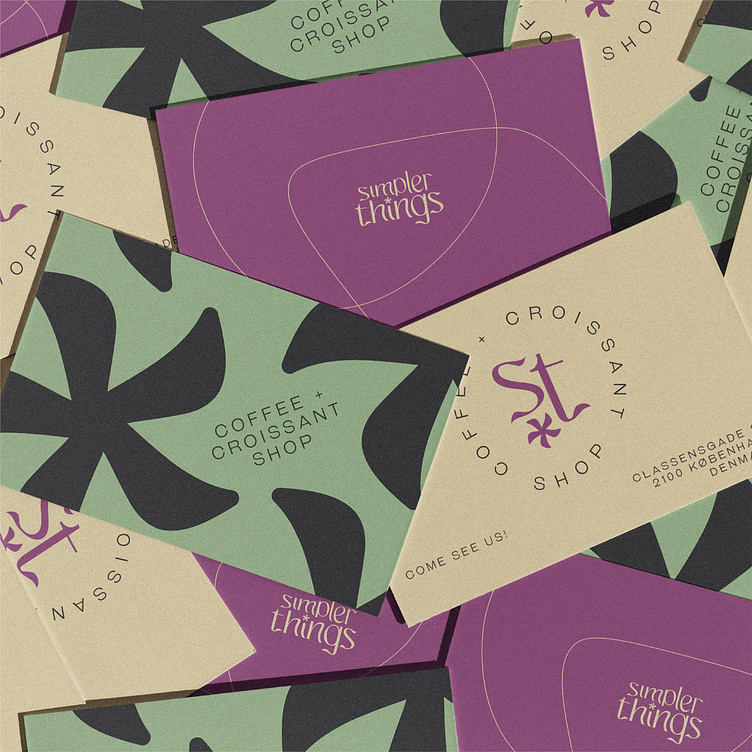
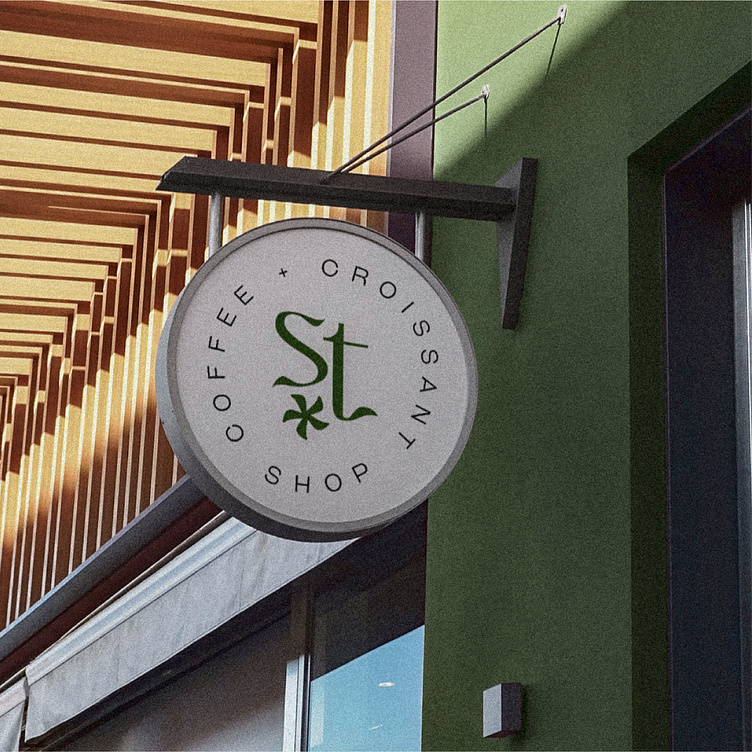
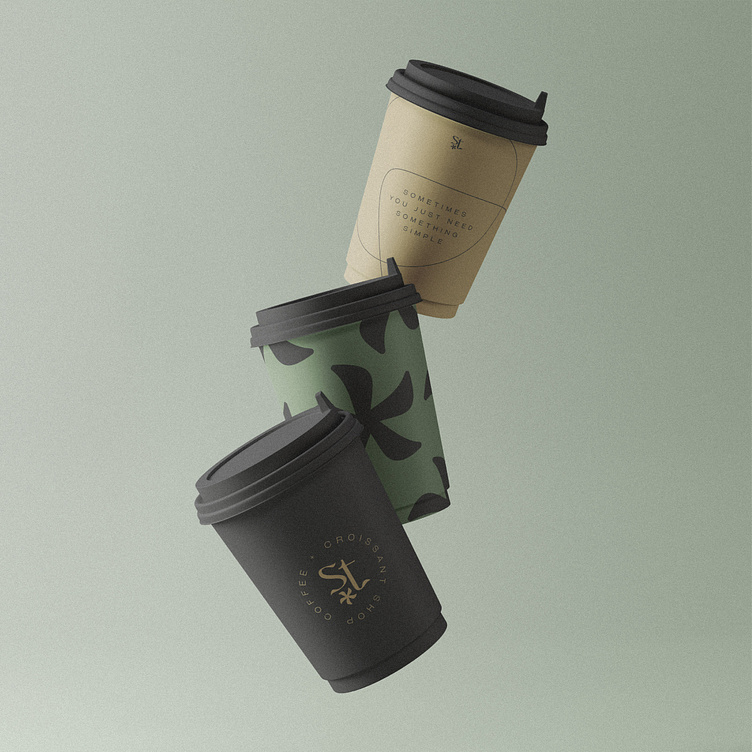
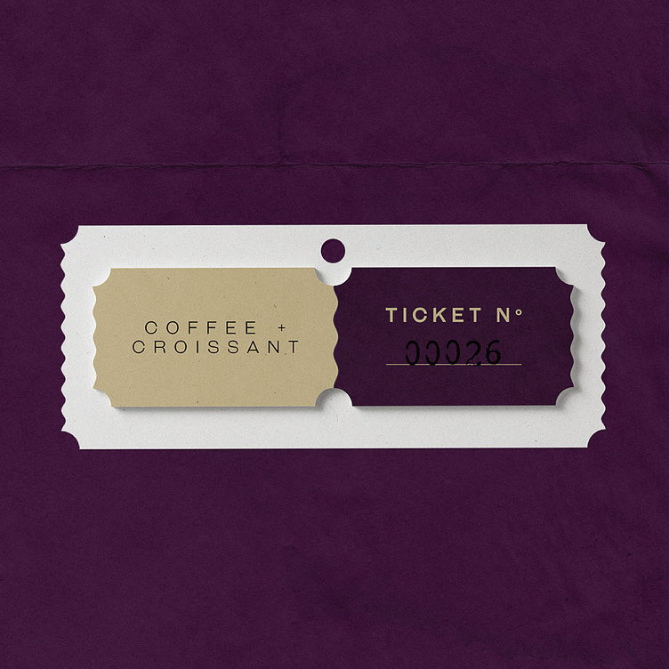
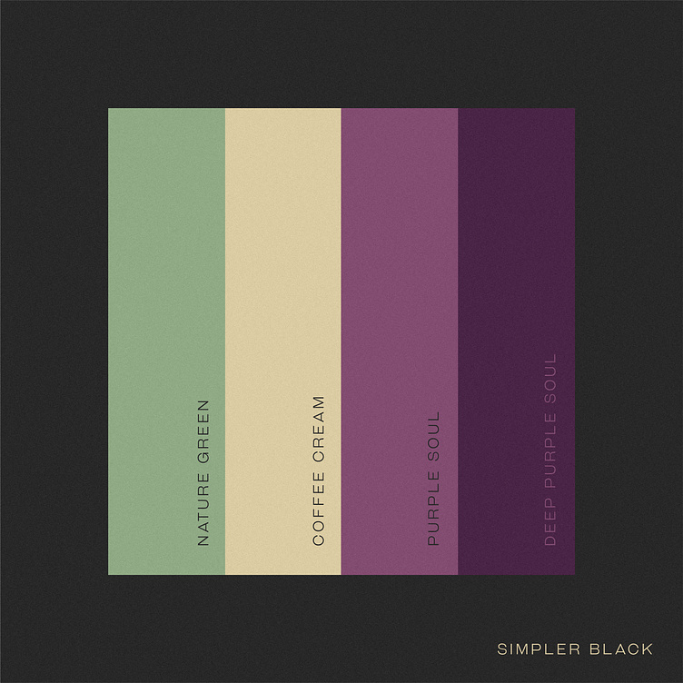
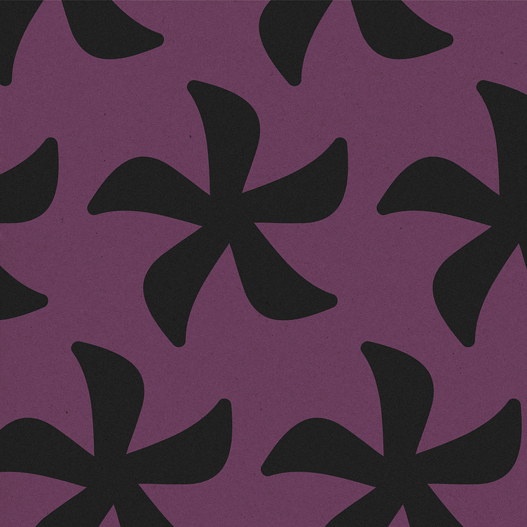
The identity consists of a primary stylistic font, a powerful distinctive element for recognising the brand. A complementary colour palette, made out of two accent tones and 3 dark tones for better contrast in use. And a set of minimalistic illustrations representing the silhouette of a coffee cup and a croissant.
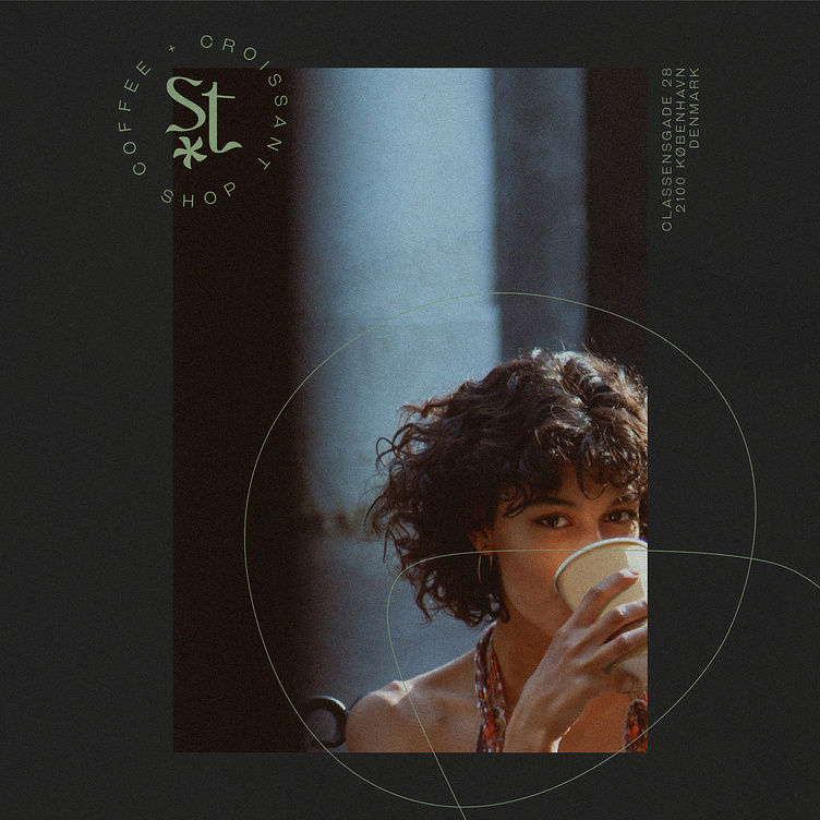
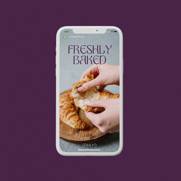
The decision of not incorporating more design elements into the identity is deliberate. By giving more space for imagery and photography we give importance to the key elements, the goods.
The combined use of the identity’s elements is simple, use of plain colours on the background, clear and stylistic text and use of illustrations filling in the negative space.


Interested in our work? Hire us.
We welcome you to visit our website at 💻 studiojuanitas.com or 📩 contact us at hello@studiojuanitas.com.
We look forward to hearing from you!
