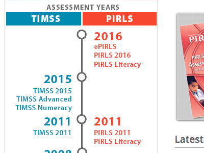
2015 website design: latest navigation
Latest iteration of the product timeline. Finally sold the team on nixing the solid blue/red background! Cleaned up the header buttons with a flat design. Higher contrast text & buttons, which includes all the products in each study year. Keeps the brand colors and spirit of the original, but with far less visual fatigue for the user.
More by Jen Moher Sepulveda View profile
Like

