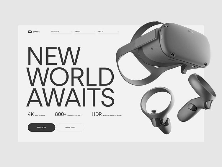
Oculus website — visual exploration
Have you ever seen a gaming-related website that is not colorful, playful, and fun? Me neither 😄 Probably because the conversion of such wouldn't be satisfactory, would it? 😉 That couldn't have stopped me from exploring a minimalistic visual direction strongly based on the typography – giving it a very robust feeling. This style of the website emphasizes the device as a tool, not a gaming device only.
Do you like this exploration? Hit the like button!
You don't like it? Tell me why in the comments section! I'm happy to discuss your perspective!
More by Fabian Barszcz View profile
Like
