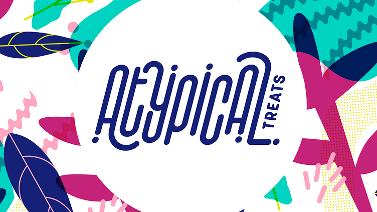
Atypical Treats
Brand Identity, Signage & Environmental Graphic, Packaging
Atypical’s name inspired us to create a custom font to make the brand look... atypical. We wanted to break the rules, so we drew a line to distance the brand, and ourselves as designers, from the common trends of the natural products industry and ended up creating something fun and quirky.
Being a plant-based product, the elements consist of a various plants, but are strategically designed to create a pattern that shows abstract figures. The white background maintains uniformity within a clean and light industry, but at the same time, we surround it with bright colors to make it stand out from its competitors.
More by mampo' View profile
Like


