Moon - NFT Marketplace that is Out of this World
Overview
My current design experience is heavy in digital marketing, specifically a broad knowledge in social media, digital media, print, and basic brand design. But I’ve recently adjusted career paths to focus on brand and product design specifically. Eager to expand my learning and skillset, I got started with Dribbble’s UI Design course. Throughout the duration of this course, I was able to start building on my foundation of design knowledge with UI fundamental principles. In this project, I am showcasing the way I have put my new learnings to the test with a creative brief based on a new NFT marketplace.
Brief
The client is Moon, they are a new up and coming startup with the goal of revolutionizing the NFT marketplace business with a design-first approach and a deeply curated experience for its users.
Establish a visual language of this new NFT marketplace app that is ready to change the digital art scene. Lock a visual aesthetic and then scale the design on multiple screens, based on the wireframes and the flow that is provided from the client. Build a UI Library with the final UI elements and create a functional prototype.
Process
The process of bringing this new marketplace together was broken into five main steps. Each step moved the design closer to a cohesive final look ready to revolutionize the market. The first step, as in any creative process was to do some initial research on the market to get familiar with what the current competition looks like. Once a foundation of knowledge was built it was time to start pulling inspiration together.
Moodboard
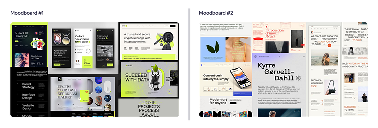
After some preliminary research, it was time to get some ideas together. In this phase I started gathering examples of any digital materials that I felt had a strong visual direction. After I took some time to gather miscellaneous design materials, I began to categorize them into two main concepts. The first moodboard was futuristic with high contrast while the other was simplistic with pops of color.
Wireframes
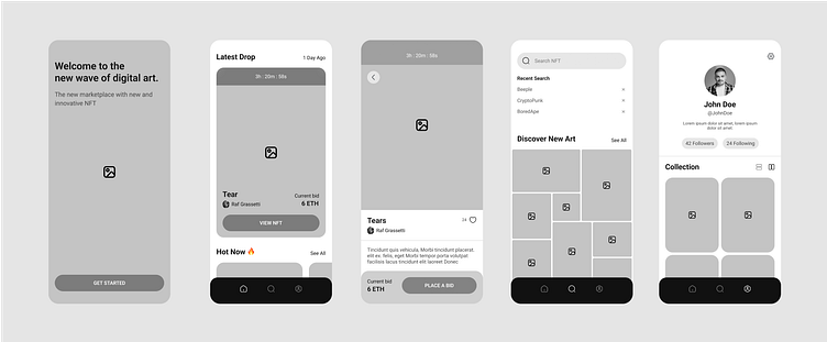
The following wireframes were the roadmap for the five final NFT marketplace screens. These screens provided a basic outline of potential elements to include in each section.
Visual Exploration
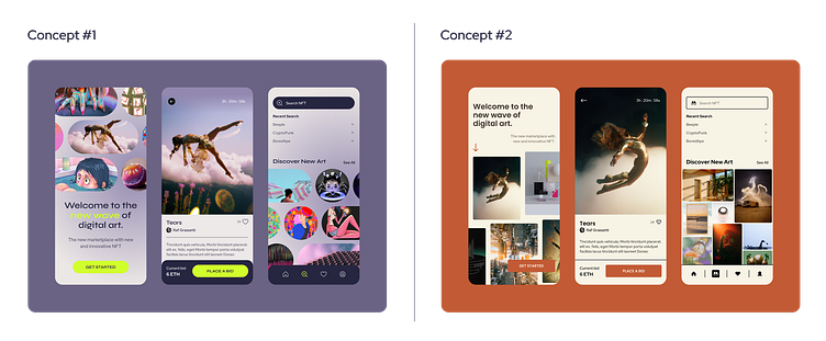
After identifying the two potential directions for the NFT marketplace, with my two moodboards, it was time to start developing the initial brand identity for both concepts using the wireframes. Starting with three screens for each theme I was able to see the direction each concept was going in. This part of the process helped me to develop a visual design that brought many elements from my moodboards together into one streamlined concept.
Direction + Scale
After seeing the results of my visual exploration I was able to identify what concept I felt was stronger. I decided the futuristic and high contrast option was the one that felt more common for NFTs. I felt it lent itself more to the product that would be sold, because it felt more modern and cutting edge. Ultimately this was the direction I went in as I continued to build out the remainder of the app screens.
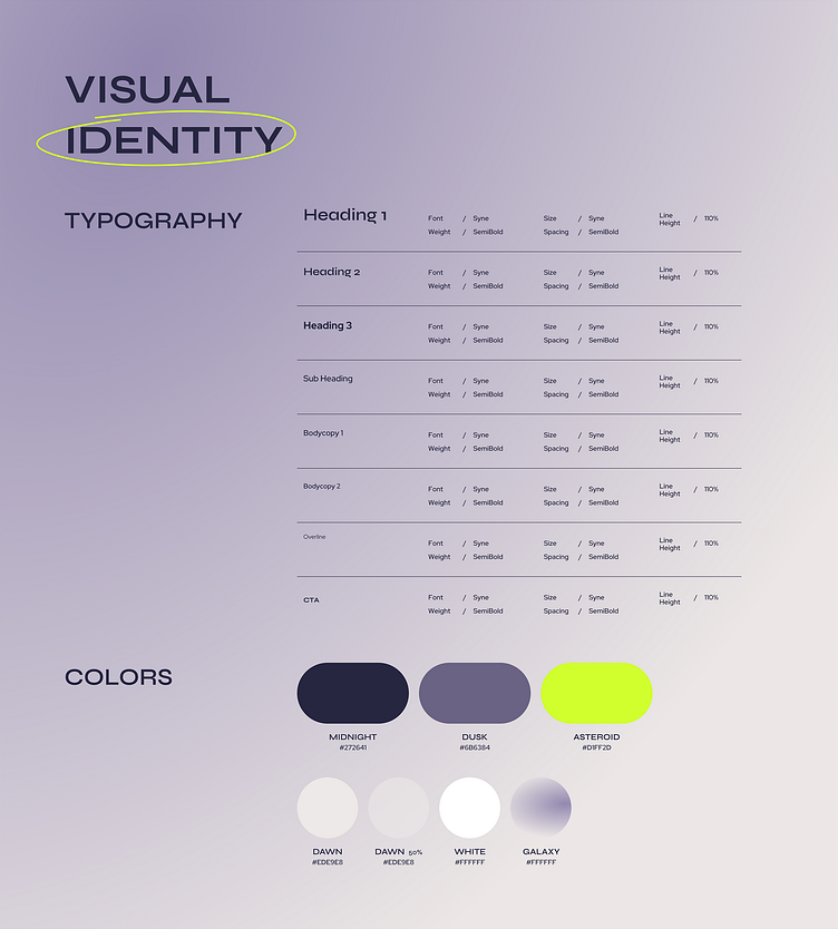
Design System
While I built out the rest of Moon’s screens I began to establish a design system for the company. The use of consistent fonts, colors, components and modules was key in executing a consistent and effective brand identity.
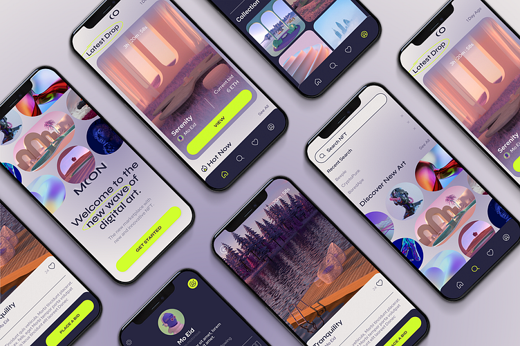
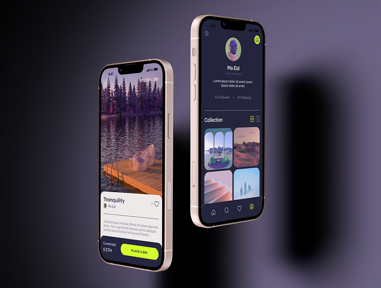
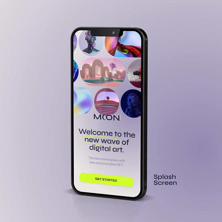
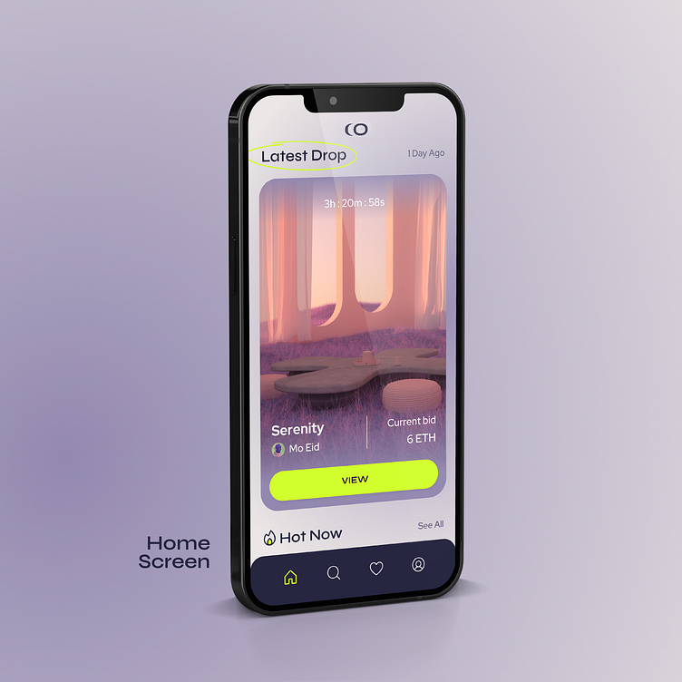
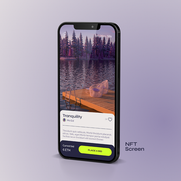
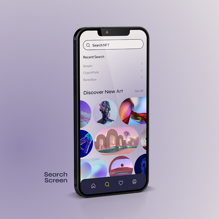
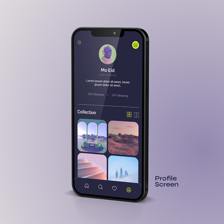
Final Screens
After a few rounds of revisions and adjustments along the way, here are the final screens for Moon, the new NFT marketplace app aiming to revolutionize the industry.
Summary
Completing this brief taught me a lot about UI design and how it is both similar and different from the design projects I have completed in the past. UI design is to me the intersection of function and good design. UI design needs to be pixel-perfect and consistent. Once a design system is developed it must continue to be replicated screen to screen while not being overly repetitive that it appears boring.
Completing this brief has shown me that the simplification of a design is often more effective and the open space leads to a more polished result. I also learned the importance of affordances and the intentionality that must be used while creating them. Overall this course has taught me how to put my initial design knowledge to the test, and it has made me excited to take on more UI design opportunities in the future.
